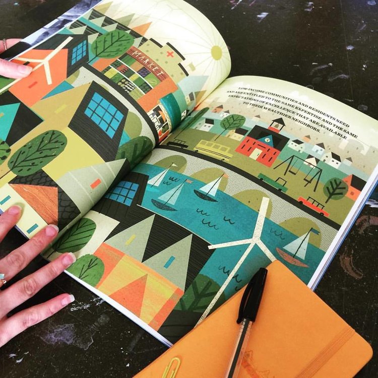
The last one I worked on was for Bluehub Capital – a national nonprofit organization dedicated to building healthy communities where low-income people live and work. I’ve worked with the agency heading this on a previous project and had a great experience, plus it seemed like a great cause. No brainer for me…
I always gravitate towards sophisticated color & design. The image, whatever it may be, should be interesting enough to make the reader want to invest time in viewing it. Above all, it must do its job of clearly communicating the message without being at all confusing.
Well, I don’t think there is a choice if you want to have longevity in this business. There is always fresh talent coming up, so if you aren’t willing to grow and evolve, you’ll get left behind. I also think it is boring to keep doing versions of the same thing, successful or not.
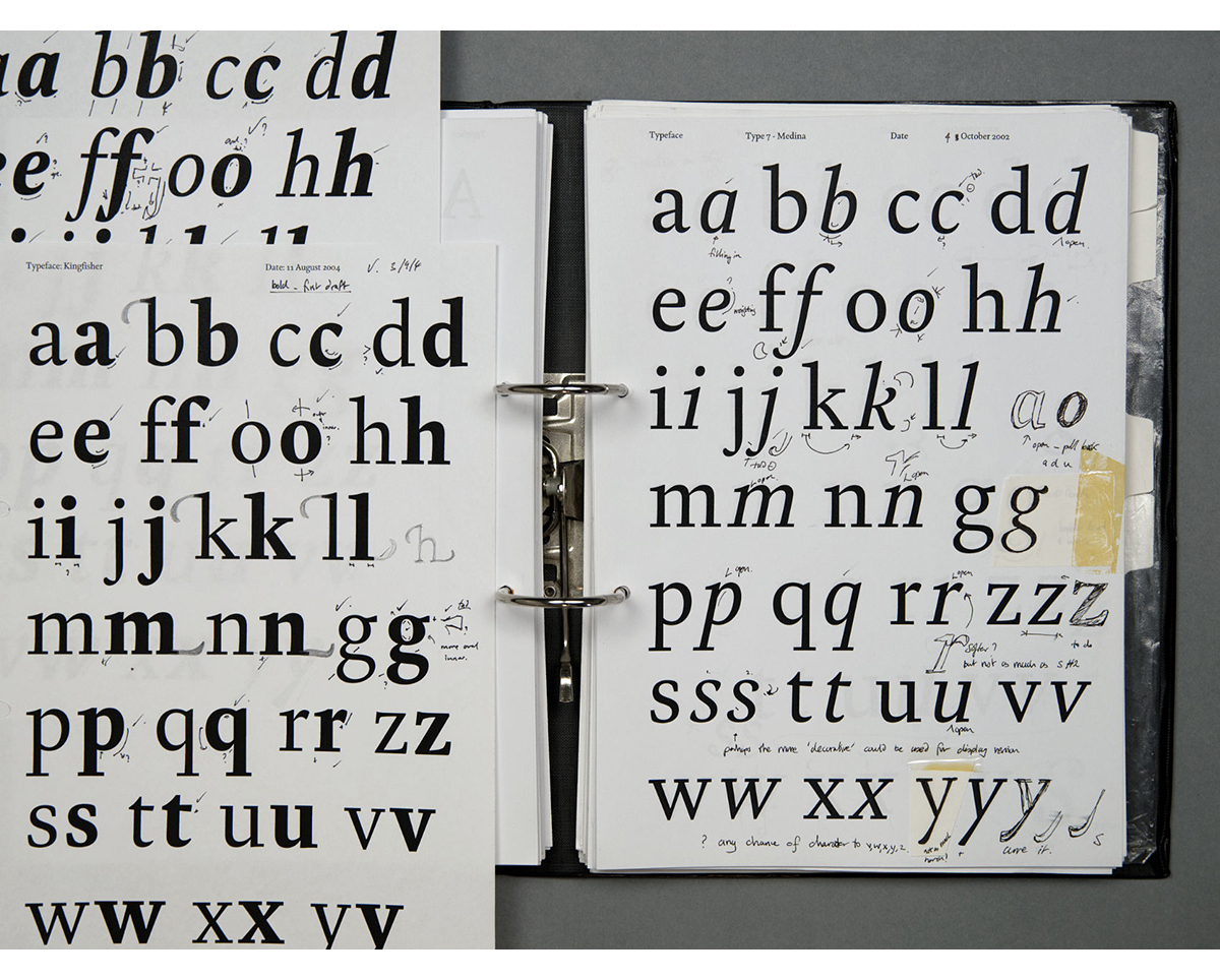
The first stage is usually conceptualising, unless the client is set on a specific idea, in which case you might skip this step. While conceptualising, I think it is important to take some time to process ideas before diving in. Don’t get too invested in the first thing that comes to mind, but in the same breath sometimes that may be the best solution. Every project is different so keeping an open mind works best for me.
I like to ask why they hired me, which images in my portfolio sealed the deal, etc. This gives me a basic idea of what they are expecting.
It’s hard to pinpoint one specific thing. When I think of some of the great art directors I’ve been fortunate to work with they seem to find a way to push me in a direction I hadn’t thought of. Not always what I wanted to hear at the time, but ended up helping the piece in the end.
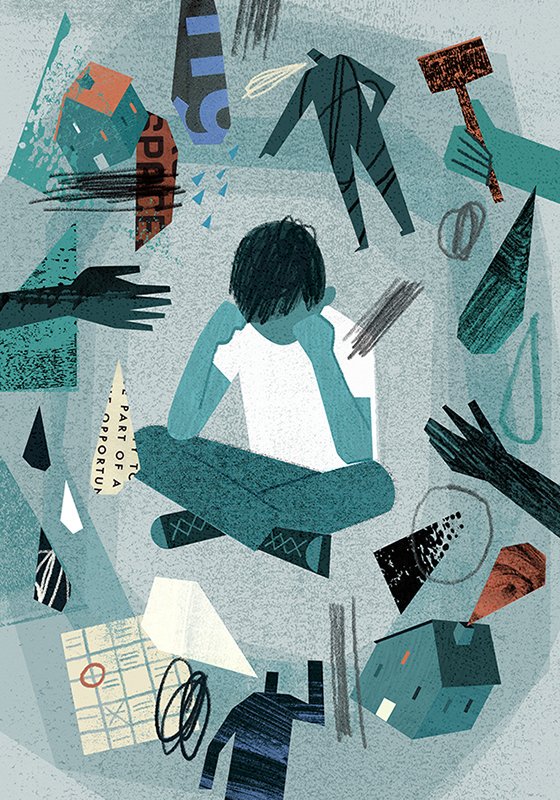
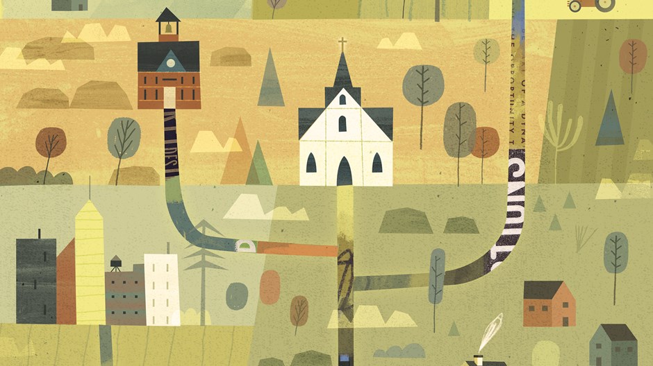
I enjoy lots of different things: landscapes, surface design, people interacting. I like finding a way to utilize a variety of shape, line, texture, etc. in whatever I’m doing.
Working on multiple projects at once can get overwhelming at times. It helps me to make a list of what I want to tackle each day, and try not to focus on the next thing. One time I emailed an art director about another job I was working on. Oops!
Just put in the work behind the scenes. Always be working on personal pieces / sketchbook exploration in between projects. Stay open minded.
I’ve been doing some art directing lately and have really been enjoying it. It’s a different kind of satisfaction being on the opposite end that I’m used to.
![]()
![]()