Austria’s largest mobility club flaunts its fun and friendly persona in their 2017 annual report with a combination of a quirky typography, numerous photographic styles and a sunny, contrasting colour scheme.
Subtly divided into sections, the account maintains a consistent structure of heading, summary, subheading and context with prioritized font sizes and bolding.
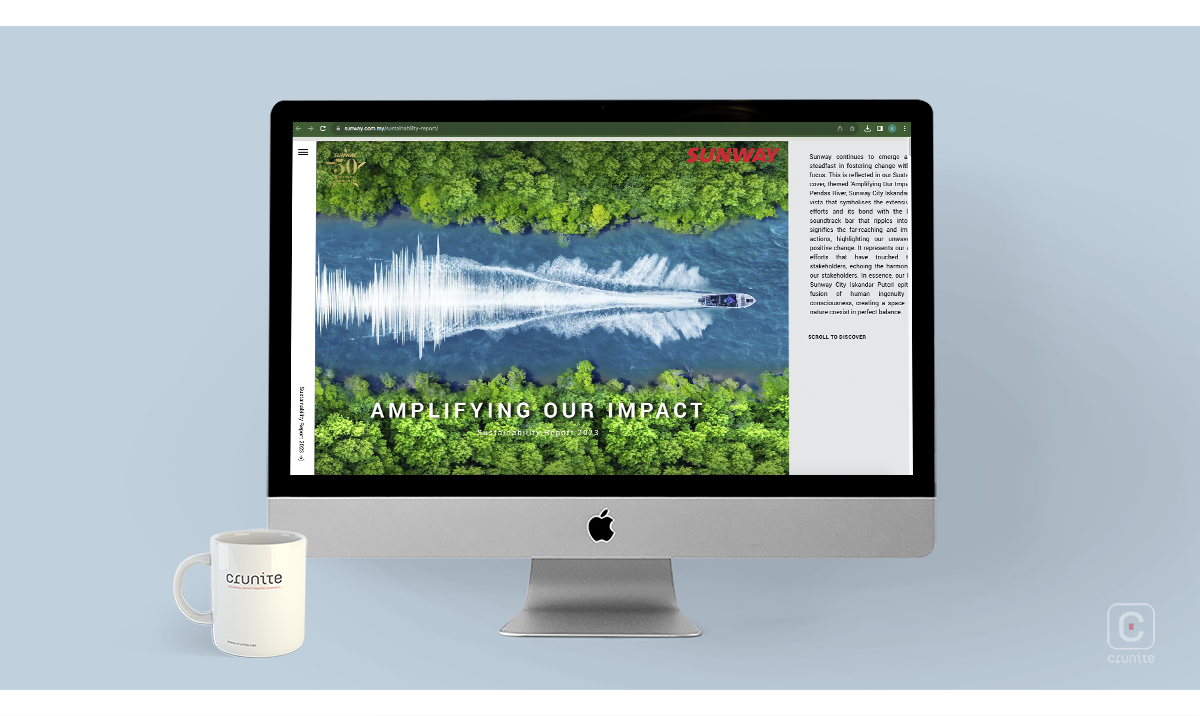
The strong sans-serif font that complements the company logo, consistent copy size and uppercase headings tie the report together, giving it a corporate feel.
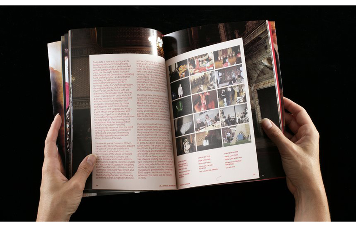
The unique layout of images and information on each page keep readers from being inundated with facts while maintaining their interest.
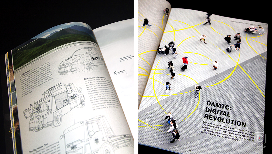
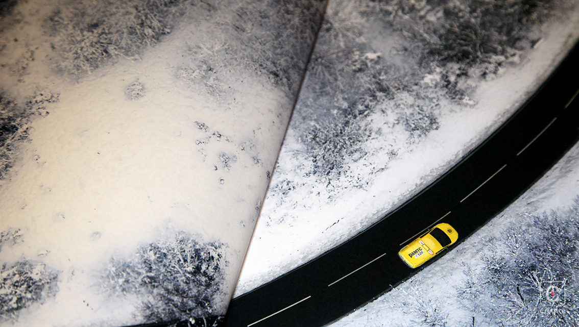
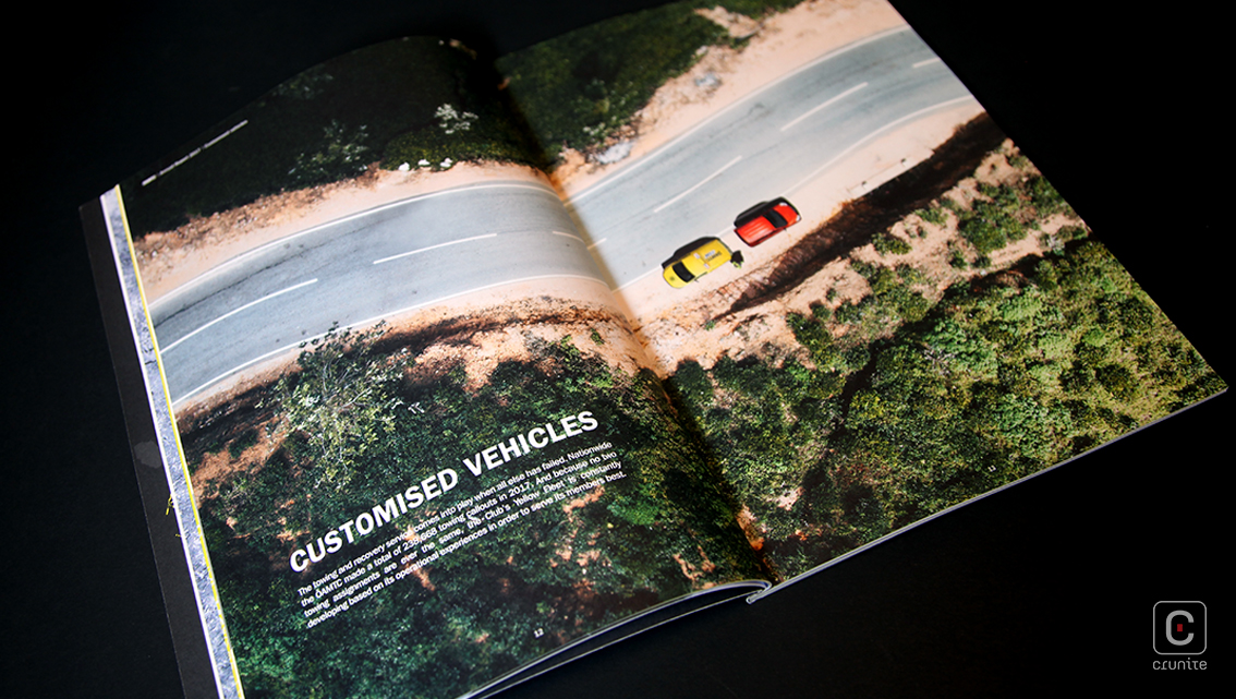
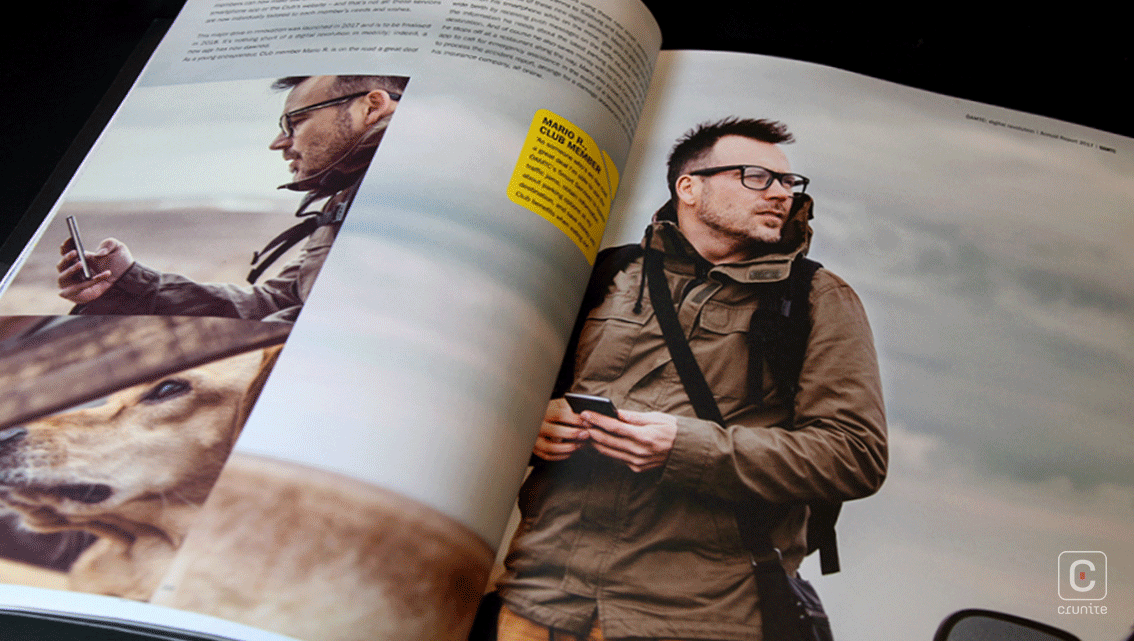
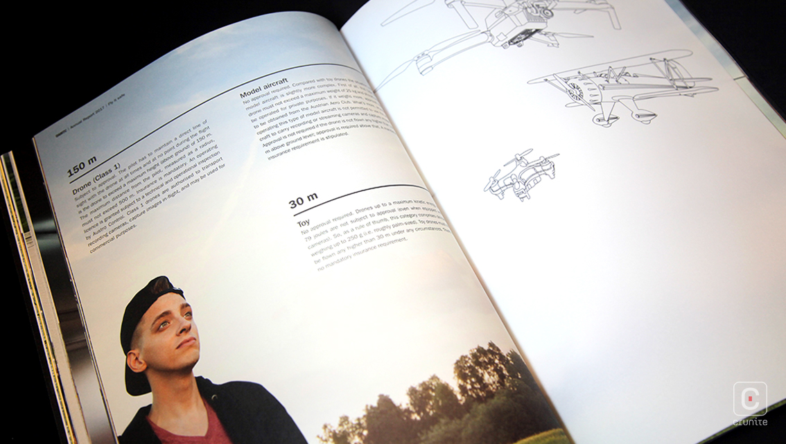
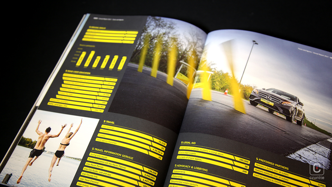
Double-page aerial photographs act as backgrounds for main section headings and summaries while reflection, angled, POV, collage, panorama, selective focus and numerous other image styles comprise at least three quarters of each of the other pages. To break the monotony, some pages even sport monochrome colour palettes, making the report more interesting and easy to read. The images feature an array of shots ranging from landscapes and nature to people, buildings and lifestyle images as well as OAMTC’s own sunny vehicles and staff.
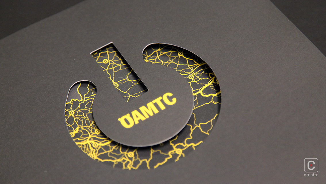
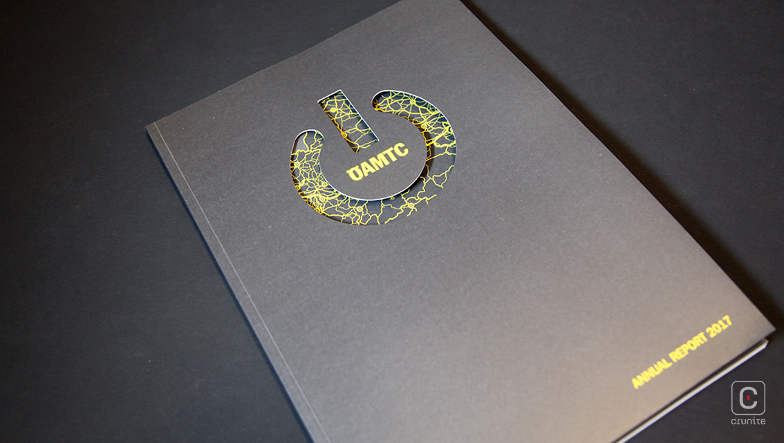
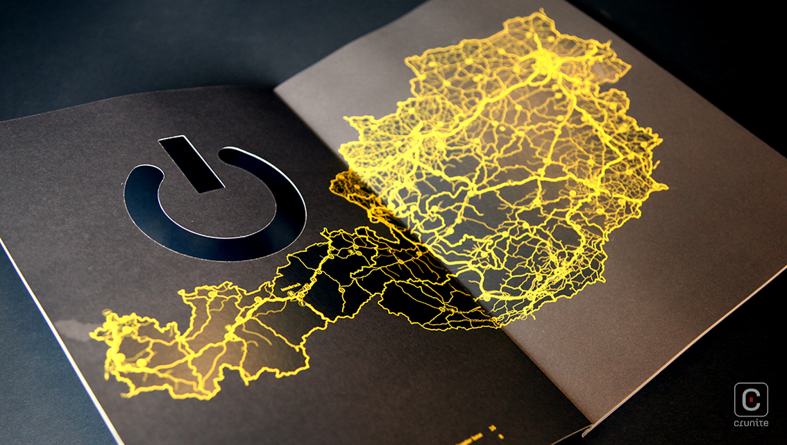
Apart from the unusual photography, the design uses OAMTC’s characteristic colour scheme of dark grey and yellow in a sui generis way; a cracked, veiny effect that is used as a map, in the logo and continues to appear occasionally throughout the account. The petite yellow boxes with a nipped corner parcel fun facts and information for casual browsers while bigger boxes house larger volumes of information.
The risky use of text over textured images and small chunks of information over clear colour spaces of pictures perfectly marries the text and imagery. The design of page numbers and headers, pen ink signatures, subheading points, logos and card and booklet vectors further enhances the bubbly personality of the account.
![]()
![]()