
The Urban Design Forum’s 2018 Annual Report is remarkably clear about what the organisation believes cities need most: people in the same room, exchanging ideas.
That purpose shapes almost every design decision in the publication. The Forum describes itself as an independent membership organisation advancing “bold solutions to urban challenges”, bringing together designers, developers, and public officials.
The report looks less like an institutional record and more like an active civic network.
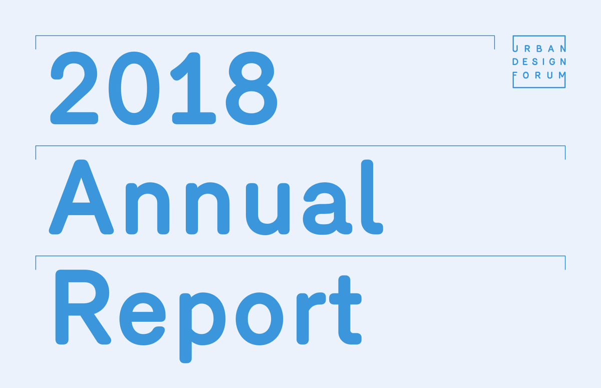
The cover establishes that tone with unusual economy. Oversized cyan typography dominates a pale field, with “2018 Annual Report” broken across the page in an almost architectural arrangement. Thin rules frame the text like construction lines, while the Urban Design Forum logo sits compactly in the top-right corner.
It is minimal, but not quiet. The exaggerated type scale gives the publication presence, while the restrained palette suggests order, clarity and contemporary urban practice. That same visual logic continues inside.
Large type gives the ideas room to breathe
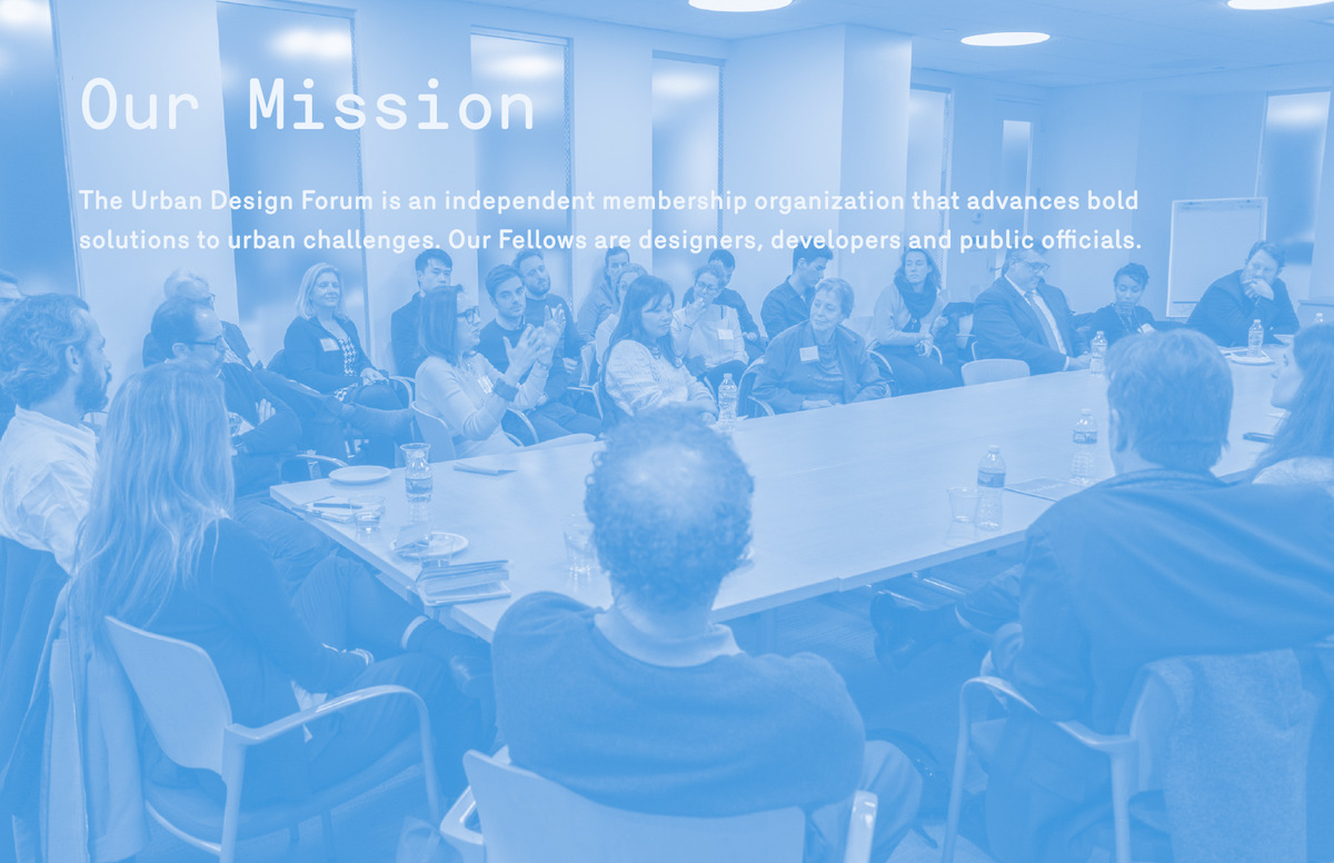
The report relies heavily on a tall, narrow display typeface that feels slightly informal and hand-drawn, especially in headings such as “Next New York” and “Global Exchange”. This helps create visual tension with the Forum’s subject matter. Urban design can easily be presented in the language of technical plans and institutional policy; here, the typography makes the organisation feel conversational and open.
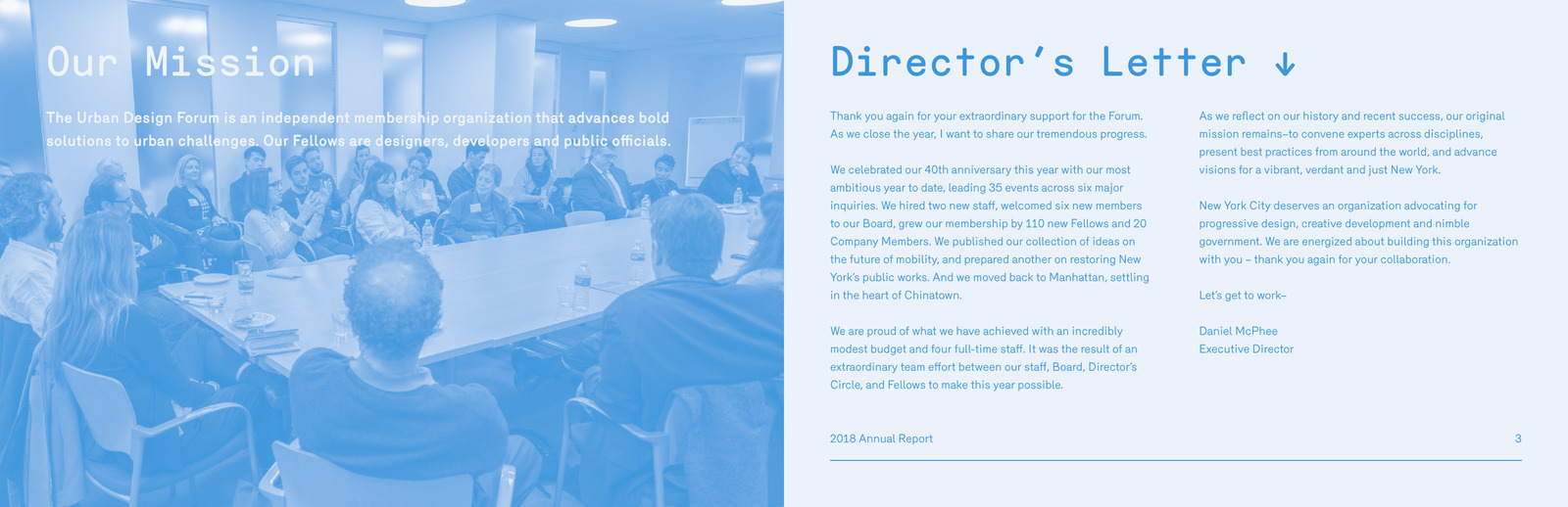
This matters as the Forum’s core activity is convening. The report reportedly shows rooms full of people talking, listening, presenting, and debating. Its photography rarely treats architecture as an object in isolation. Buildings are not the hero; people using, discussing, and shaping the city are.
The city is presented through people, not skylines
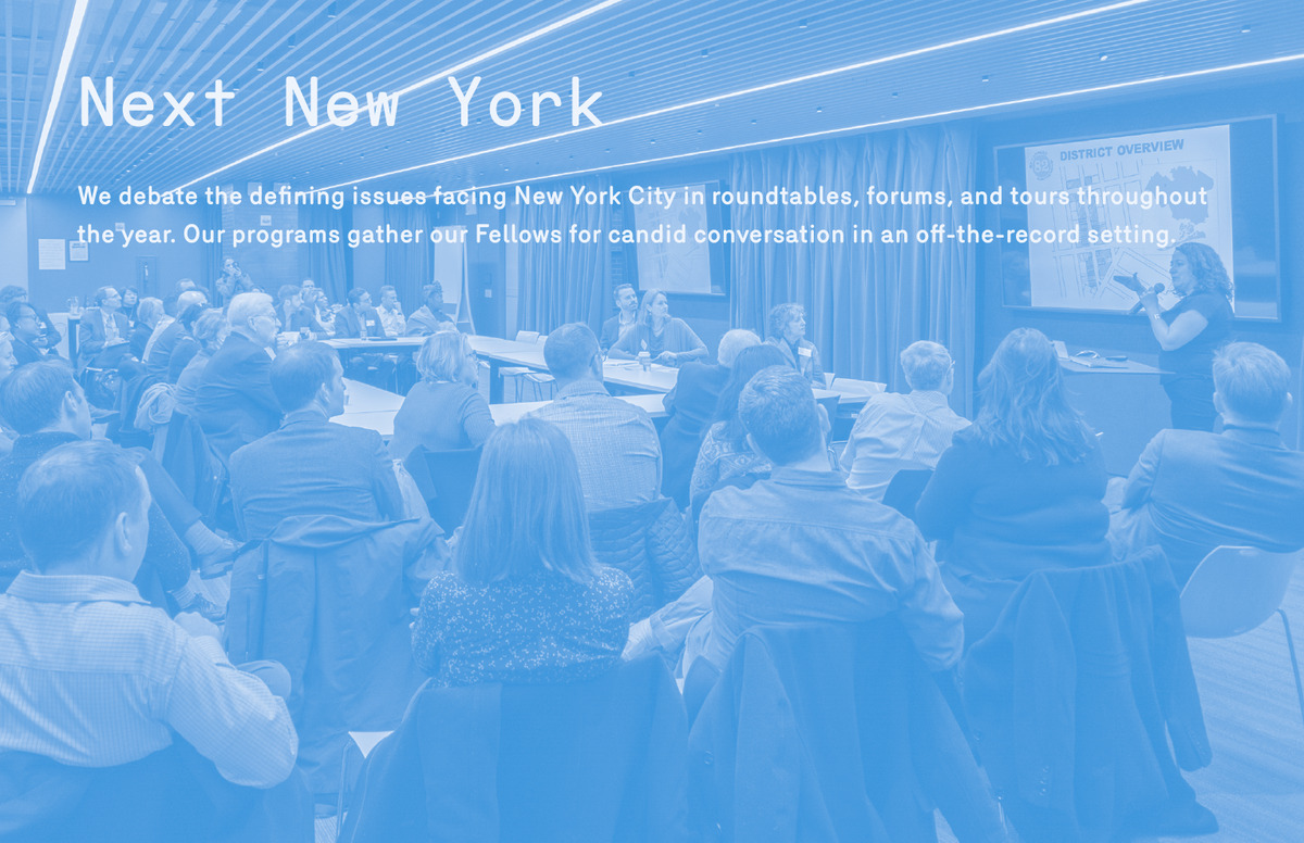
The monochromatic photographic treatment is one of the report’s strongest devices. Rather than allowing each event image to introduce a different colour palette, the report overlays the photographs with a strong blue cast. The approach turns very different events into parts of the same visual system.
It also prevents the photography from becoming merely documentary. The images record who was there, but the colour treatment transforms them into brand elements. A Director’s circle luncheon, a policy roundtable and a fellowship workshop all feel connected because they belong to the same visual world.
This is especially effective given the organisation’s breadth of programming. The Forum’s activities range from mobility and public works to economic development, housing, immigration, and homelessness. A consistent visual treatment keeps that diversity from becoming fragmented.
Different conversations, one civic agenda
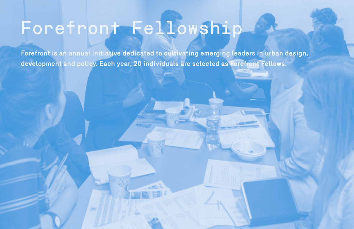
The layouts reinforce that structure. Most programmes follow a highly repeatable formula: a large title, a concise description, lists of events or speakers, a photograph, and a small cluster of impact metrics.
These figures are not treated as oversized performance statistics. Instead, they are integrated quietly into each programme story. That choice fits the Forum’s identity: success is measured not only by scale, but by the number and quality of people brought into dialogue.
Impact is measured through conversations
The report is also unusually good at showing processes rather than just outcomes. Different sections in the report (“Design for Arrival”, “Shelter for All”, etc.) document workshops, tours, community organisations, stakeholders, and shelter visits.
This gives the publication a workshop-like quality. The design does not imply that urban problems have been solved; it shows an organisation bringing people together to investigate them.
The slightly angled photographs used on many programme spreads reinforce this sense of activity. They feel less like fixed frames and more like working materials pinned onto a page.
Nothing feels finished, as the work is ongoing
 The repeated downward arrows beside headings are another small but effective device. They suggest continuation and progression, guiding the reader through the report while giving the pages a digital, interface-like quality.
That visual cue aligns neatly with the Forum’s role as a platform. The organisation is not positioning itself as the final authority on New York’s urban future, but as a place where ideas move from one person to another, and from discussion toward implementation.
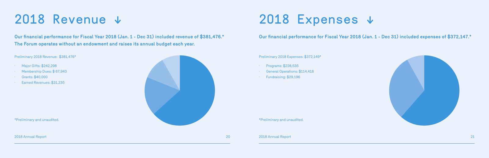
The financial pages maintain the same restraint as the rest of the report. There is no dramatic stylistic shift – the same typography, palette and generous white spaces continue, keeping institutional accountability within the same visual narrative as programmes and people.
A civic organisation expressed as a visual network
What makes the report distinctive is not complexity, but consistency. Cyan photography, oversized typography, modular layouts, and repeated programme structures create an identity that feels contemporary, collaborative and open.
The visual language mirrors the Forum’s mission precisely. It is less about monuments and more about exchange; less about finished plans and more about gathering expertise.
The result is a report that communicates something larger than annual performance:
cities are shaped through conversation, and the Forum designs the space for that conversation to happen.
Back