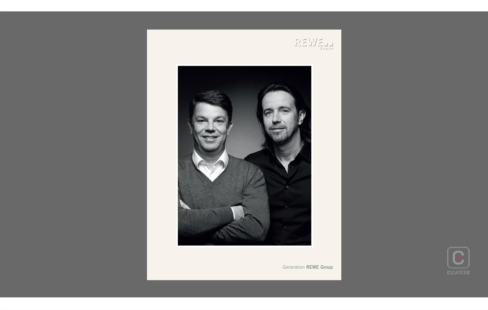
Quality or quantity? There is no question, you get both in Clariant’s ‘All in One’ 2017 report. Rolled into one 244-page publication are the sustainability, financial results, governance and compensation data, the idea being they are mutually dependant. The Swiss Chemicals group is one of the first companies in Switzerland to produce this type of integrated report. Approaching a quarter of a thousand pages the printed volume won’t win any awards for its weight: with so much substance it’s difficult to put things concisely. However, the simple, clear, direct design and great typography and graphics should keep readers engaged.
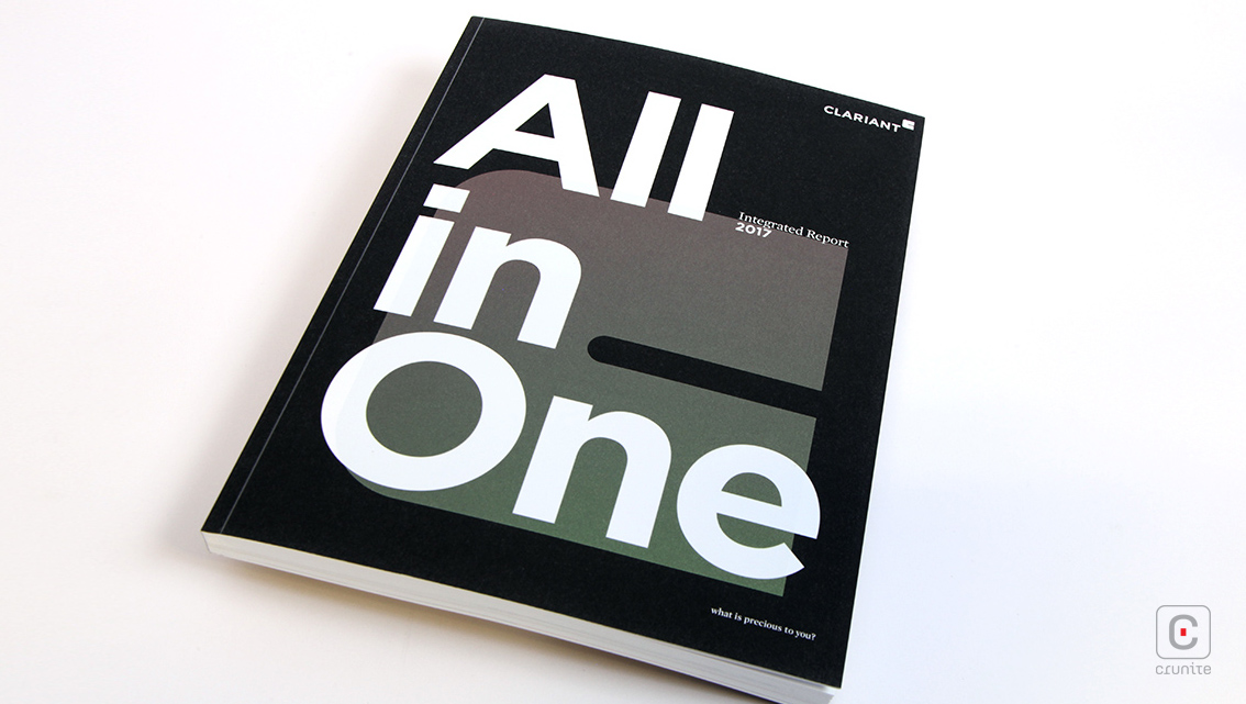
The matte black background of the report’s front and back covers uses soft touch lamination which produces a velvety finish. This instantly engages the reader’s sense of touch and impresses the design with a little personality. It is wonderfully tactile and conveys a sense of sophistication and quality. Contrasting behind the emblazoned white title ‘All in One’ lies the chunky Clariant logo shimmering subtly in metallic ink. These three elements give a stunning finish and the report’s ‘wow’ factor.
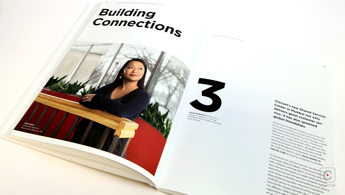
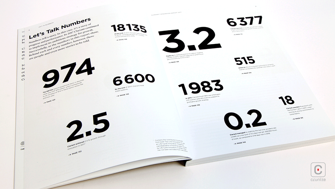
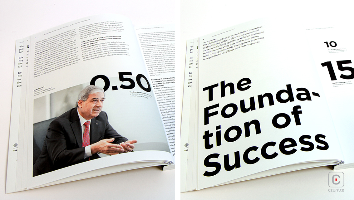
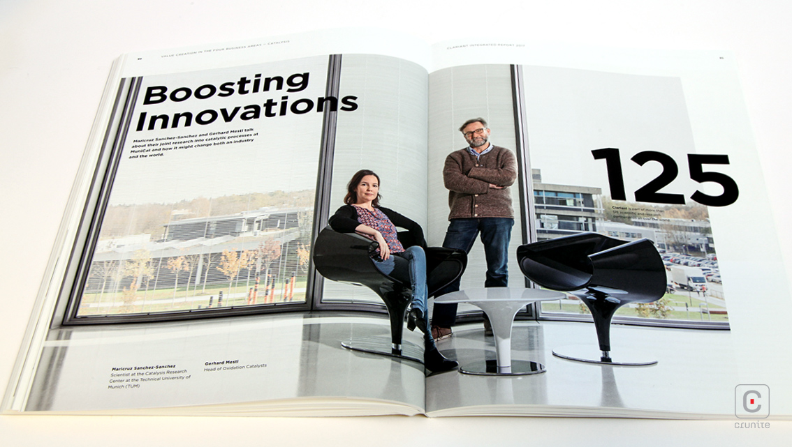
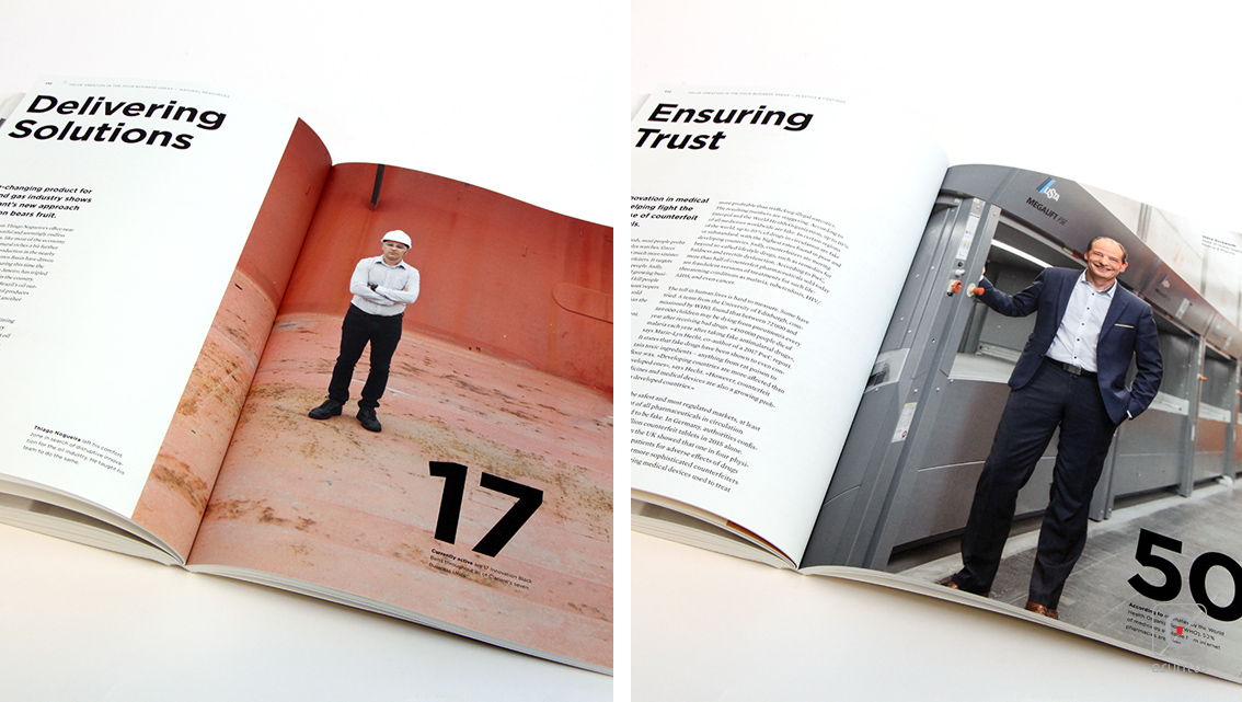
Outstanding features of the report are its modernist typography and infographics. Flicking through the contents eager eyes are attracted to information adeptly positioned either next to or below beautifully positioned numbers on sleek, uncluttered, white backgrounds. Navigation of the other pages is also quick, easy and functional. Bold, black numbers of varying size are systematically scattered on invisible grids steering the reader’s attention, connecting the story and defining each topic. This treatment draws attention to statistics and snippets of information and makes it easier for readers to comprehend and understand them which is useful as this report is no different to many others in that it provides lots of complex data.
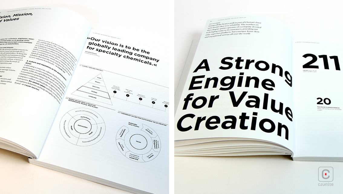
As well as numbers, readers are kept engaged through the use of flat, thin-lined, circular-based infographics. The minimal, black and white, simple icons are introduced on page 36. The crisp illustrations are then peppered through the report connecting complex information. The reduced style creates transparency, makes the report easier to navigate and supports the storytelling element.
Back
![]()
![]()