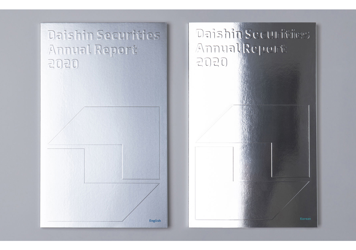
Daishin Securities is a South Korean company in the business of financial investment. The faux-platinum cover of its 2020 annual report dazzles, and combined with its embossed text and logo, it provides a radiant first impression.
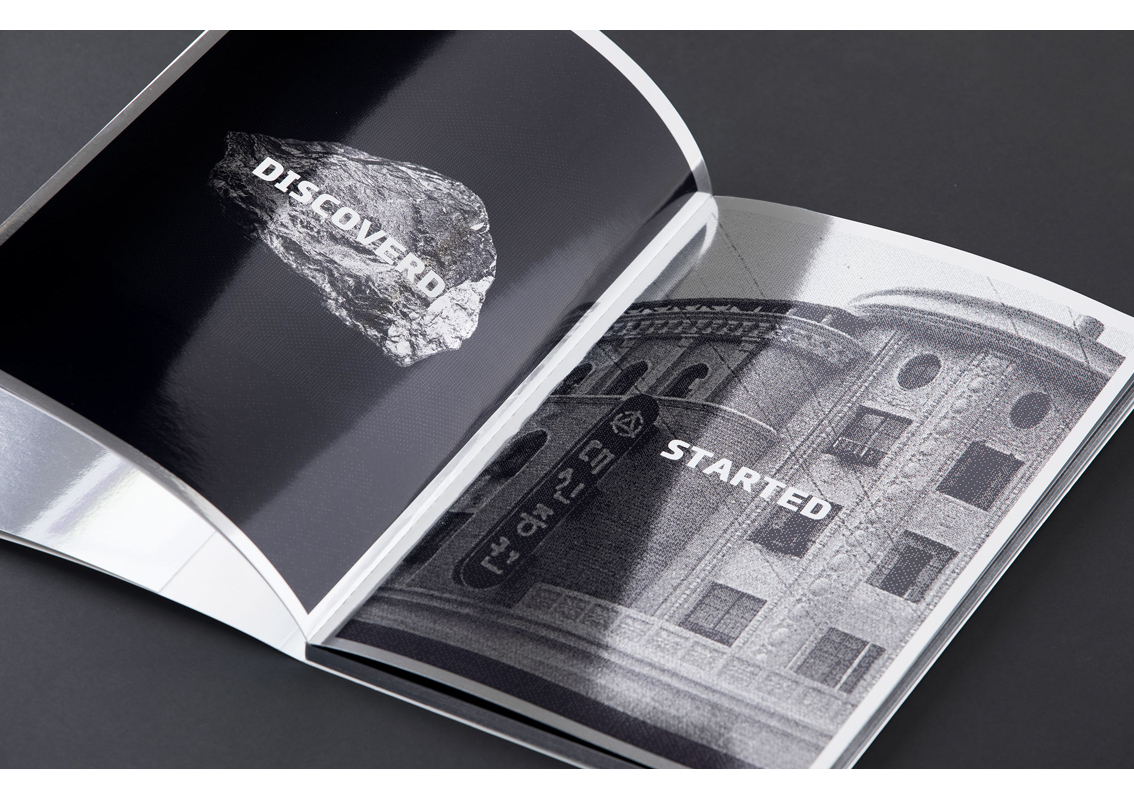
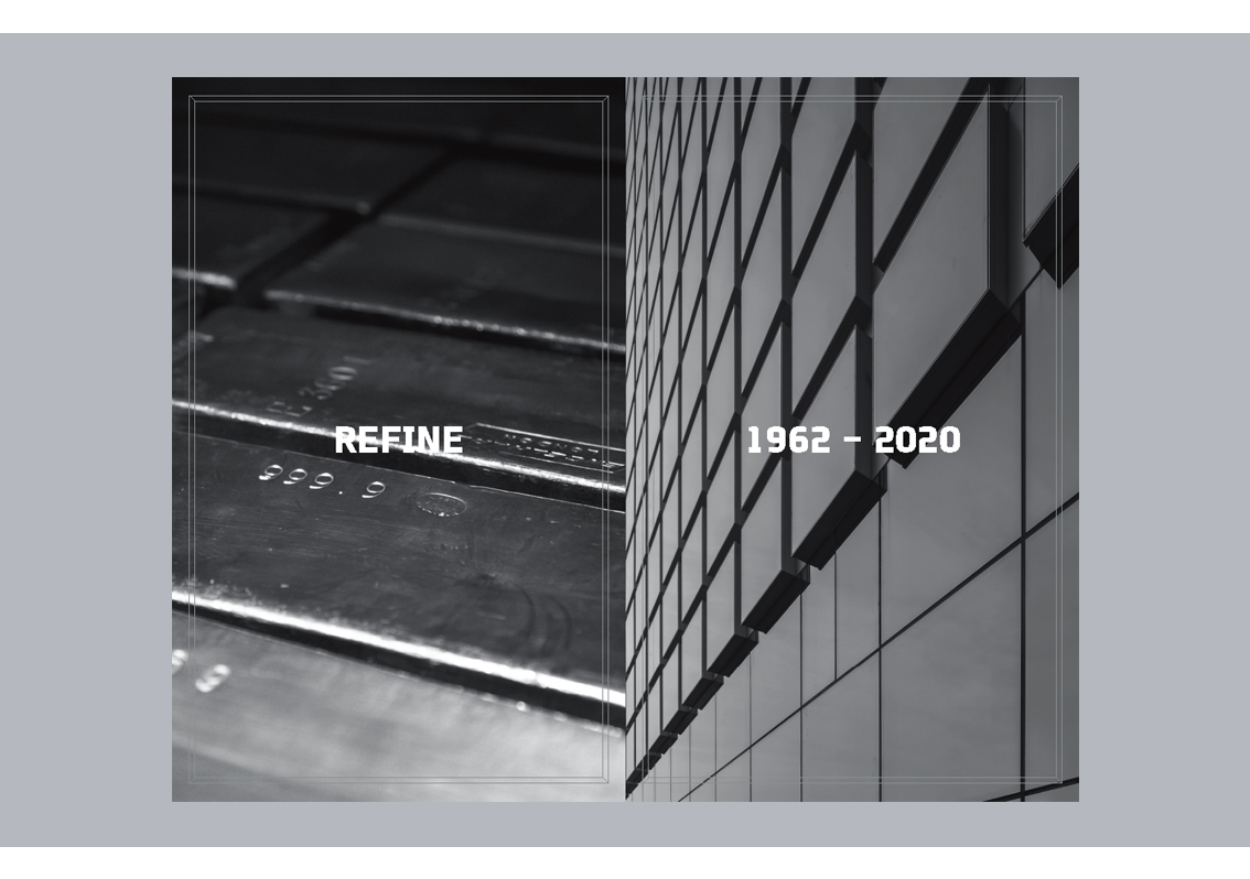
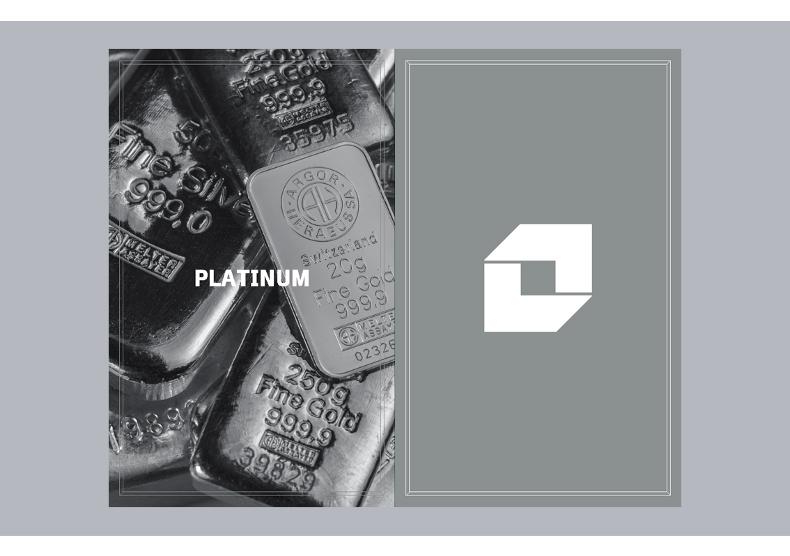
The metallic effect of the cover continues in the first few pages, which exhibit a series of photos, communicating the journey of the company from inception stages to the present, combined with a parallel story of the discovery of platinum. These photos are in black and white, to create a sense of nostalgia and also, to match the look of the report.
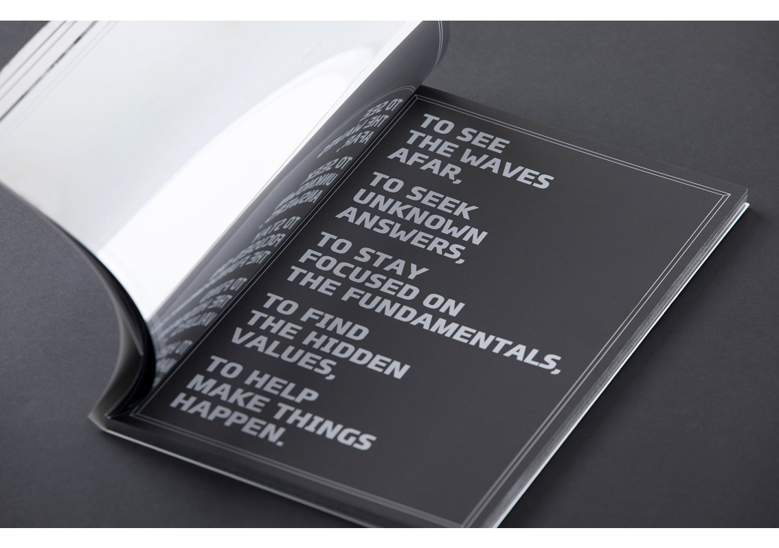
A poetic prelude explains the overall vision of the company, picking up from where the thought-provoking photographs left off.
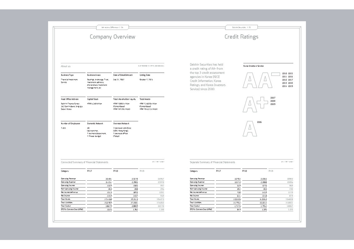
Infographics are large and creative and use varying shades of grey. This creates a nearly 3-dimensional effect on pages 12-13 and 28-29. Bar graphs are diagonal, with a subtle resemblance to the company logo.
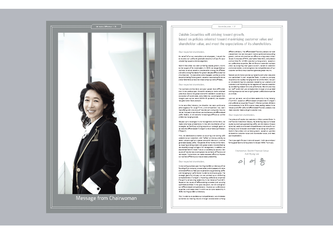
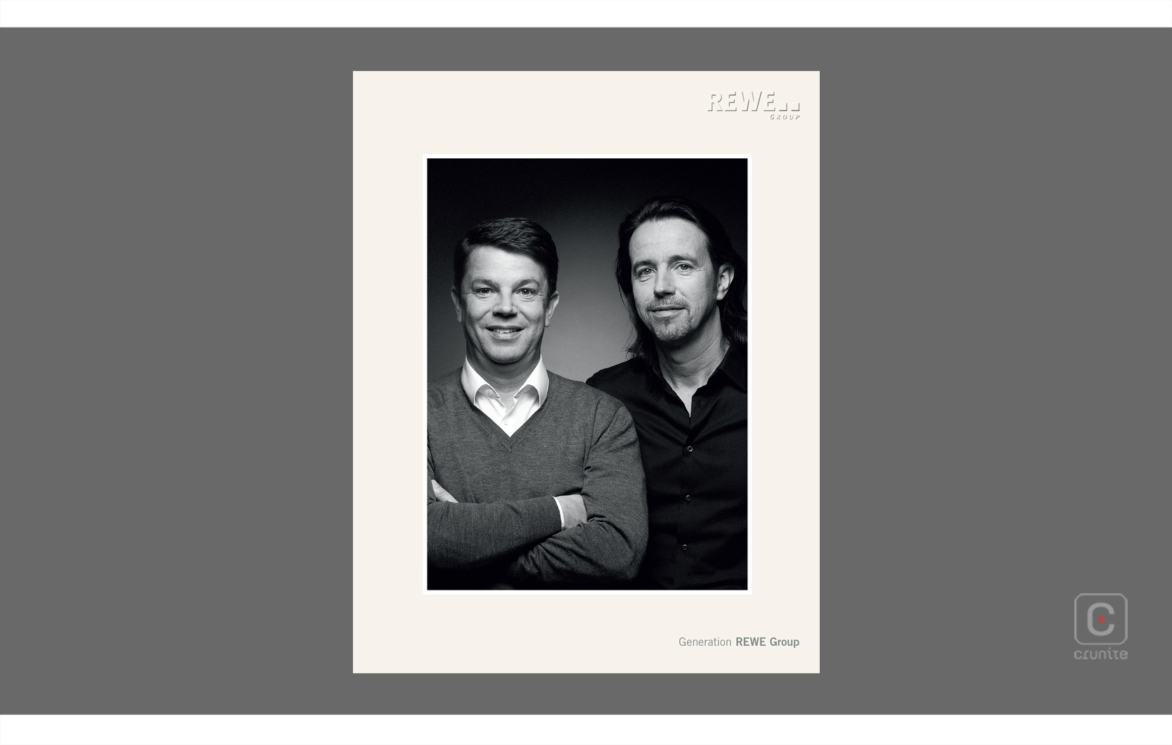
A bright blue ink is used as a navigation tool, to highlight areas of importance. Photography of the company leaders is notable, as again, it blends seamlessly with the sophistication of this report, a design choice that shines through.
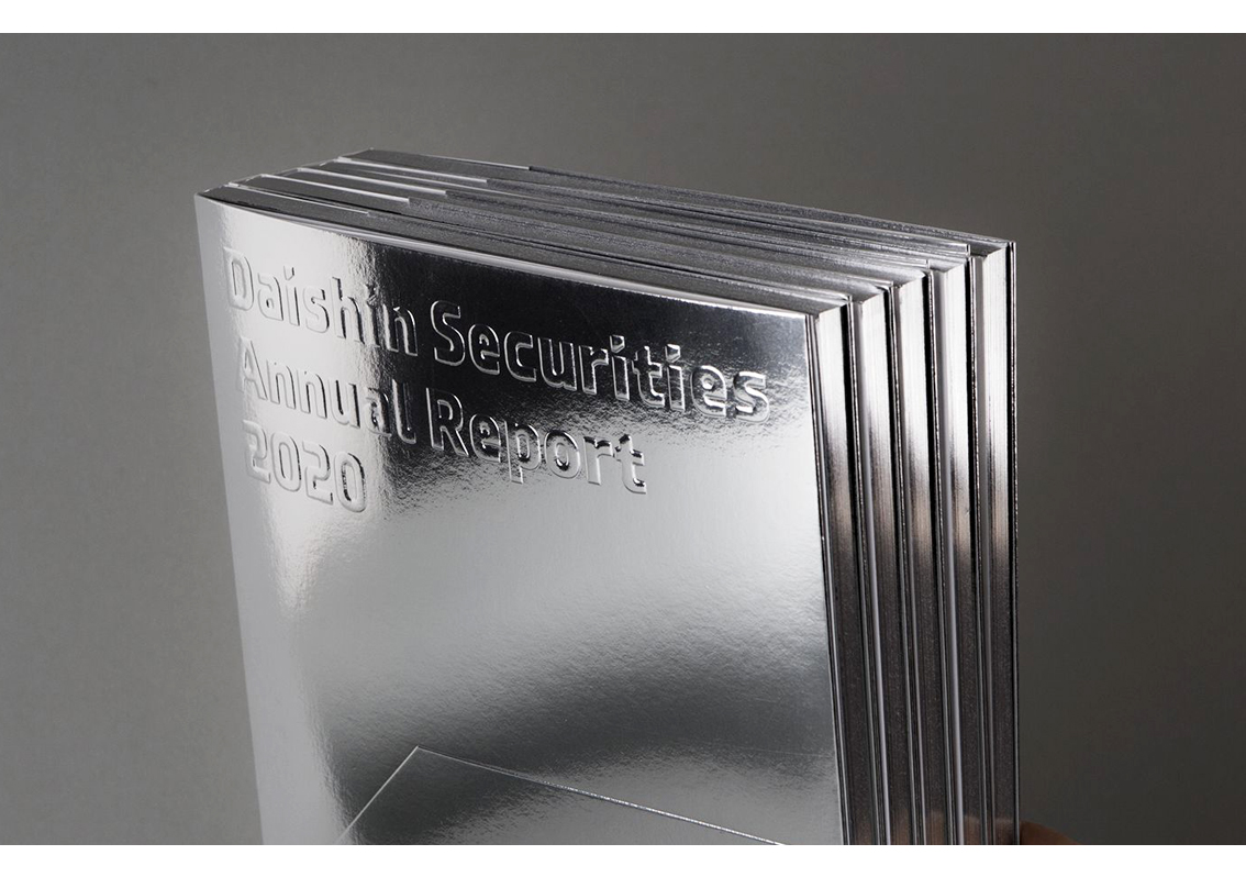
Image credits: Daishin Securities
Back![]()
![]()