Linde is the world’s largest industrial gas company and while the cover of their 2011 report may be unremarkable, the use of photography in the book is worth studying.
The designers appear to have chosen the double-page spread as their unit of creation and it is very well used. The report is split into two books – the report proper and the CSR booklet.
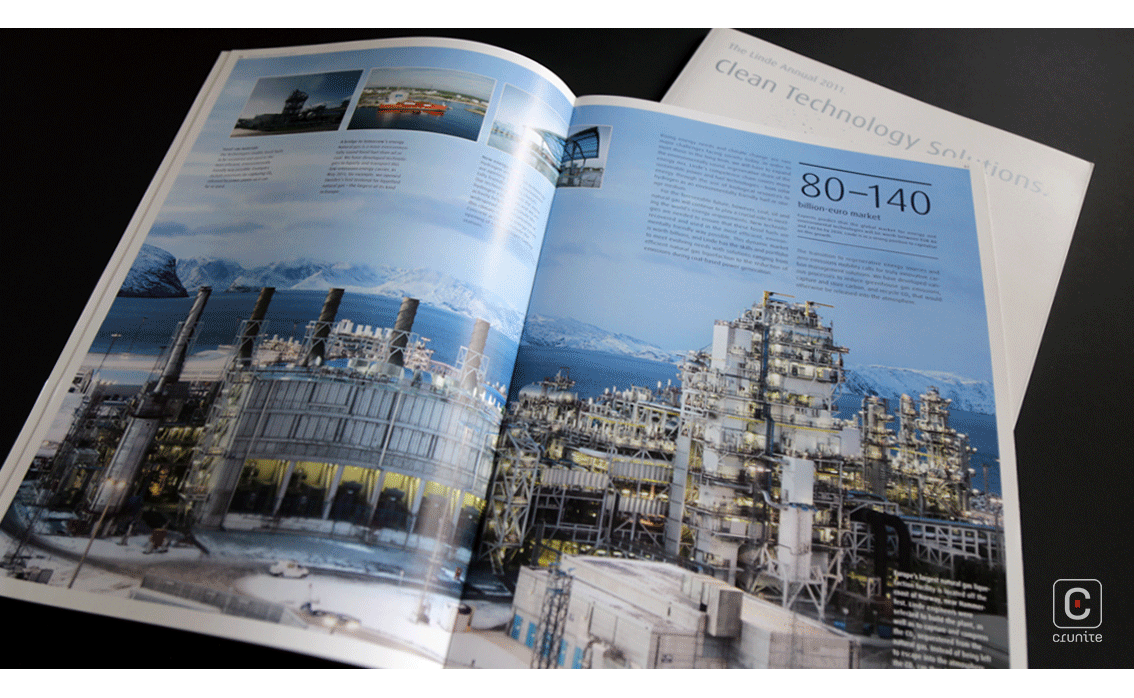
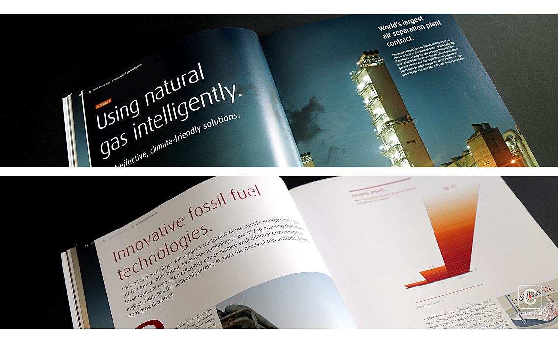
The CSR booklet primes the reader with two beautiful double-page images, both of which have been composed with a subtle horizontal dividing line. The main report capitalizes on this and expands on the idea by using a similar format but using two different (but related) images. This is where the report starts to shine.
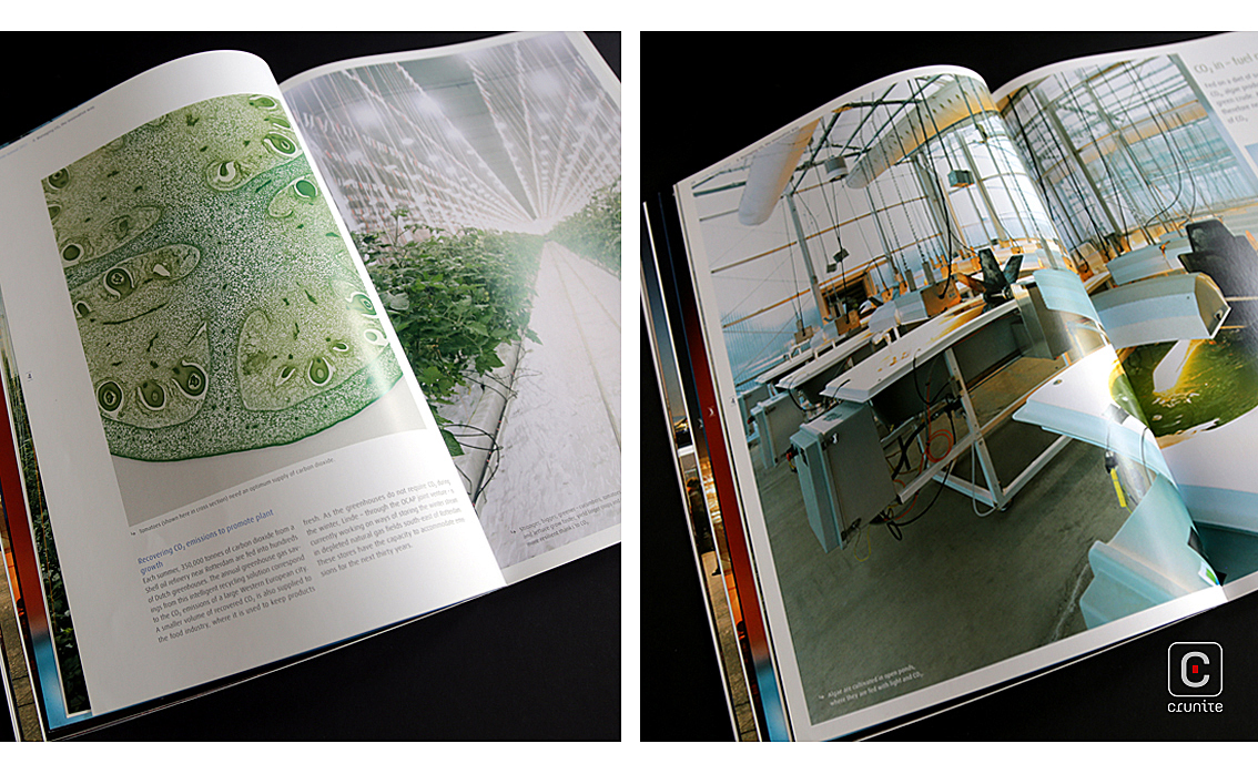
These double-page spreads with their stacked horizontal images ask us to compare two aspects of the same theme. In many cases the images are a macro and micro exploration of a single subject – a wide-angle shot of an air separation plant at night placed above a close-up shot of its employees heading to work. Later in the book we are given a an image of sinewy blue-green algae shot through a microscope and asked to compare it to an aerial shot of curling roads in a busy city.
The designers are asking us to compare and contextualize the company’s work using these visuals, meaning that you get an understanding of the company before you begin reading. It’s an elegant bit of design and it is used well in the report. It’s nice (and rare) to see double-page spreads being used so cleverly.
Back
![]()
![]()