Founded in 1927, the REWE Group is a private cooperative. Their businesses include supermarkets, groceries, tourism, and home improvement shops. Based in Cologne, Germany, their name comes from ‘Revisionsverband der Westkauf-Genossenschaften,’ which means ‘Western Buying Cooperatives Auditing Association’.
REWE’s 2011 annual report uses colour in a highly focussed way, via a clever application of black, white, and grey.

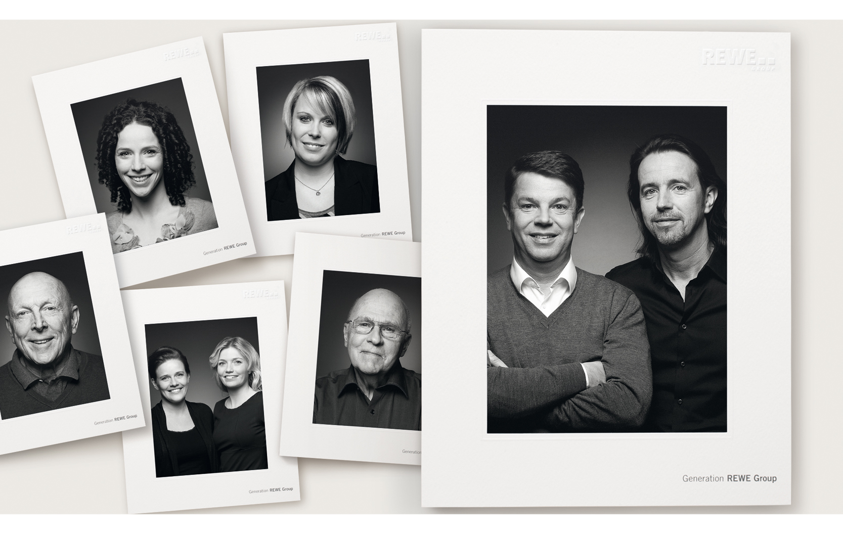
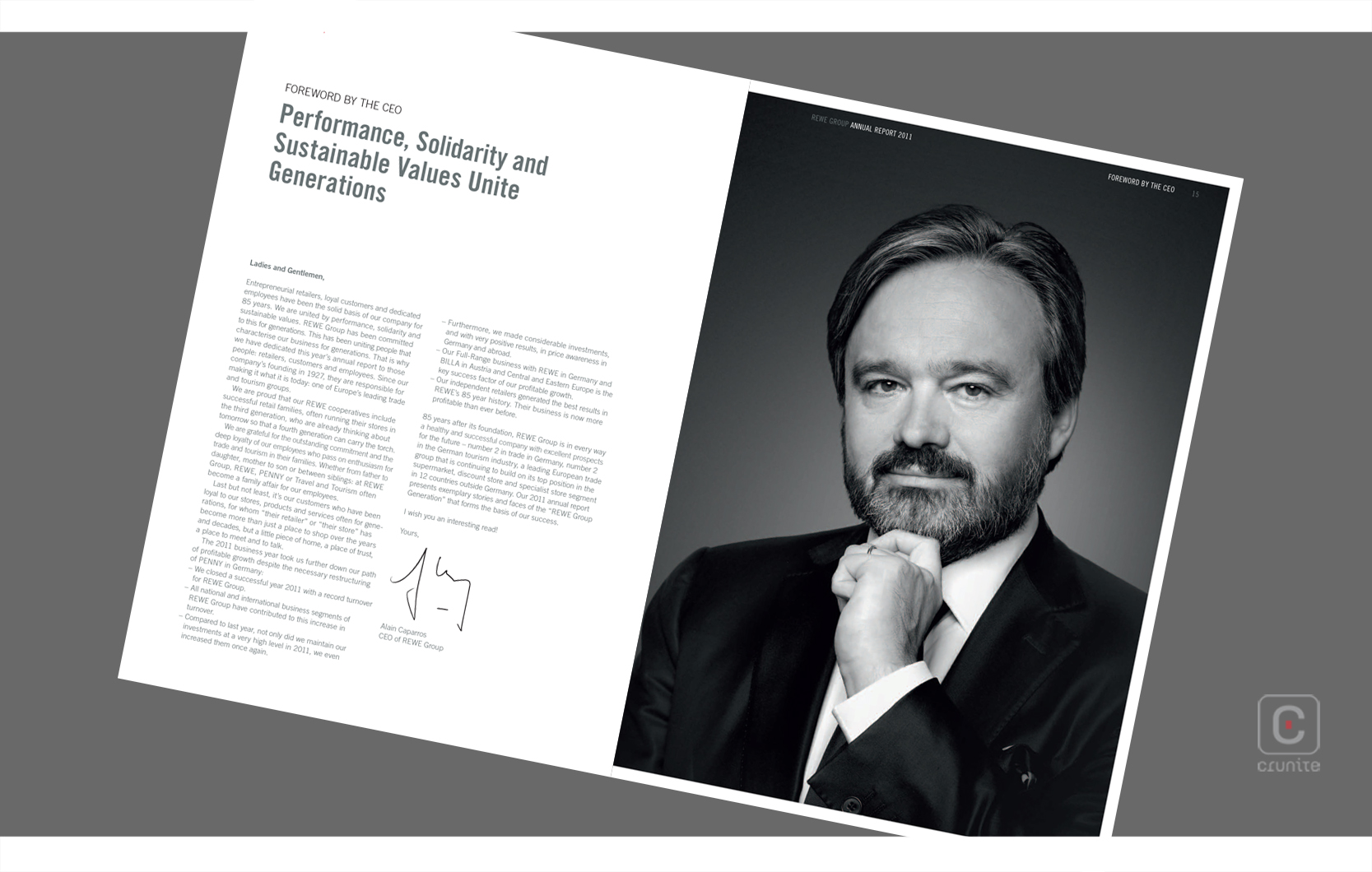
The report opens with an unusual picture choice on the cover: REWE’s co-managing directors. They are photographed in black and white and the image is presented as a photograph framed by a thin white border, and set against a pale buff background. Title text appears in a cool grey. This sets the colour palette for the report but holds back the colour technique that is the core of the report.

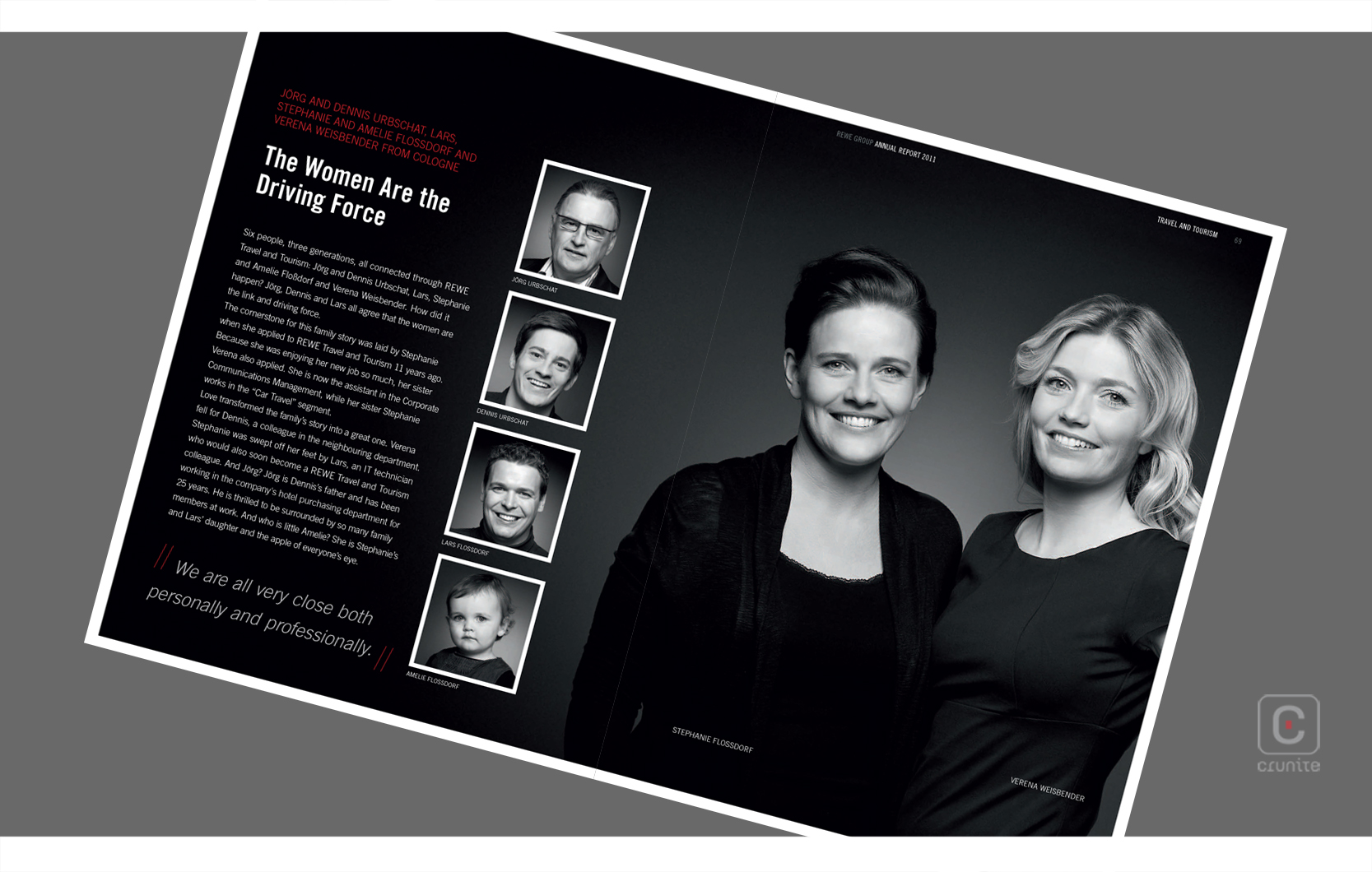
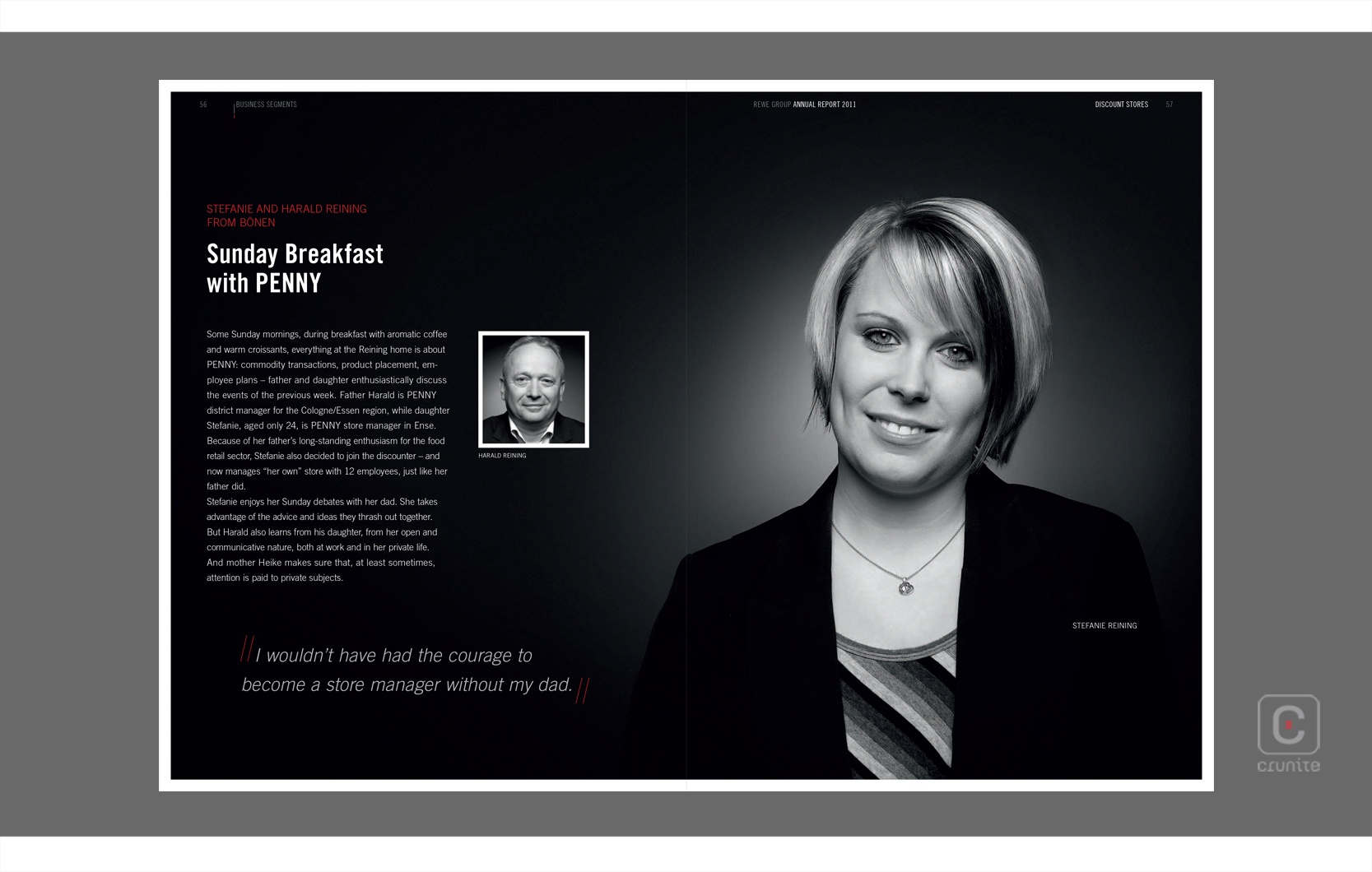
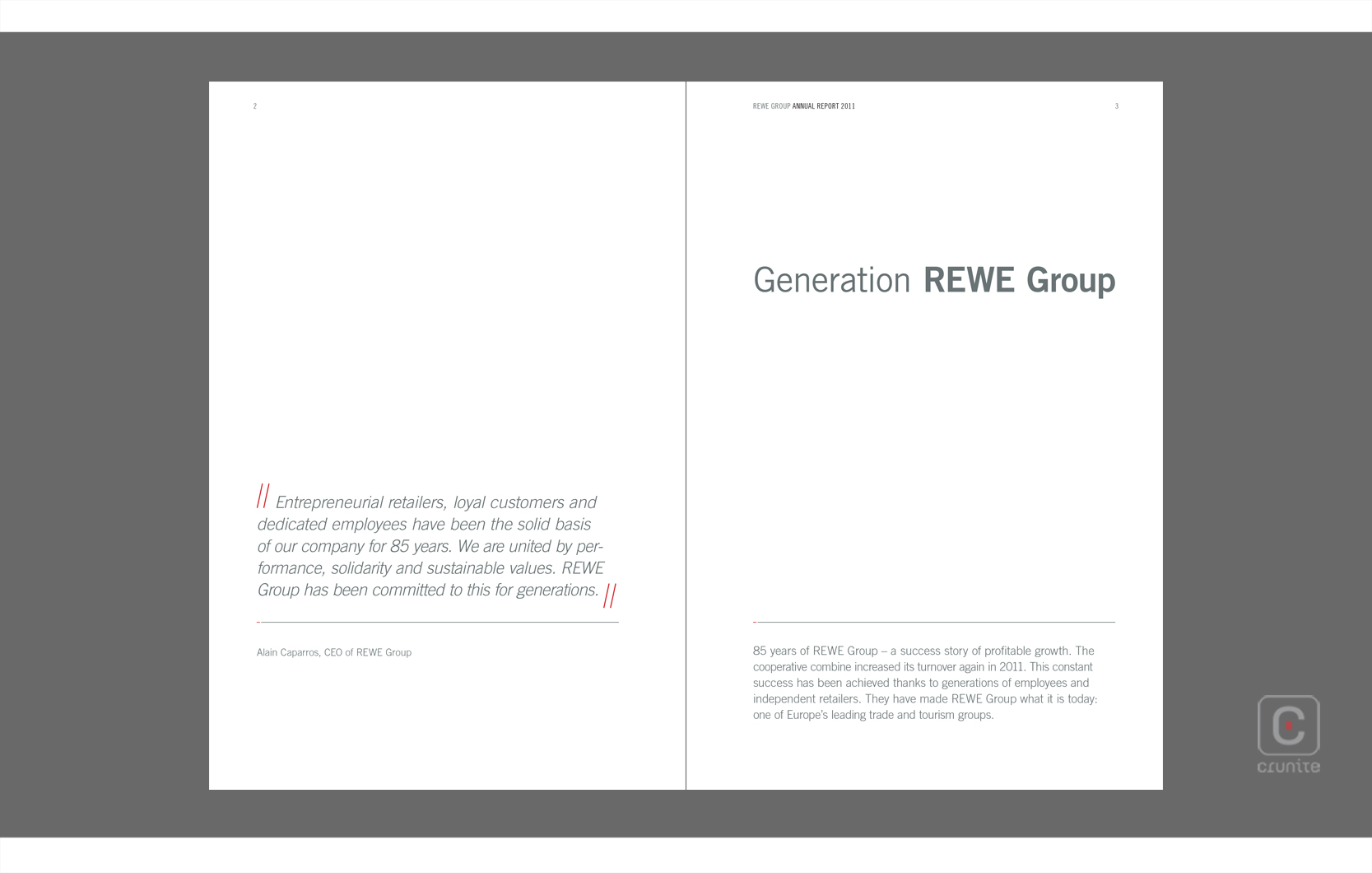
The first use of colour is on page two, where a pair of red double lines serve as speech marks near a pull-quote. In and of itself, this use of colour is reserved, but it focuses the eye.
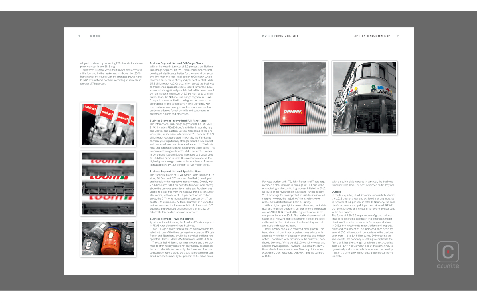
It is followed by a page which is almost entirely full-colour logos. The reader’s eye is now primed to spot these logos when they crop up throughout the report, as part of photographs of buildings or product packaging.
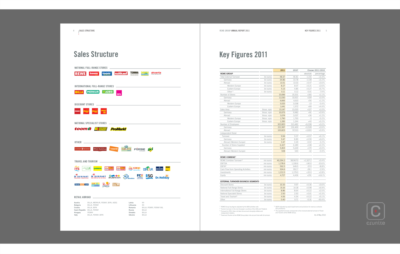
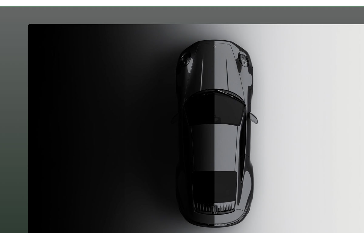
In all cases the image that houses a logo is converted to black and white, making the logo stand out even further. This effectively guides the eye around the report. A final touch is the grey used for the title text on the cover. This cool grey tone and others like it are applied to all text in the report, further making the colour pop. Simple techniques, cleverly used.
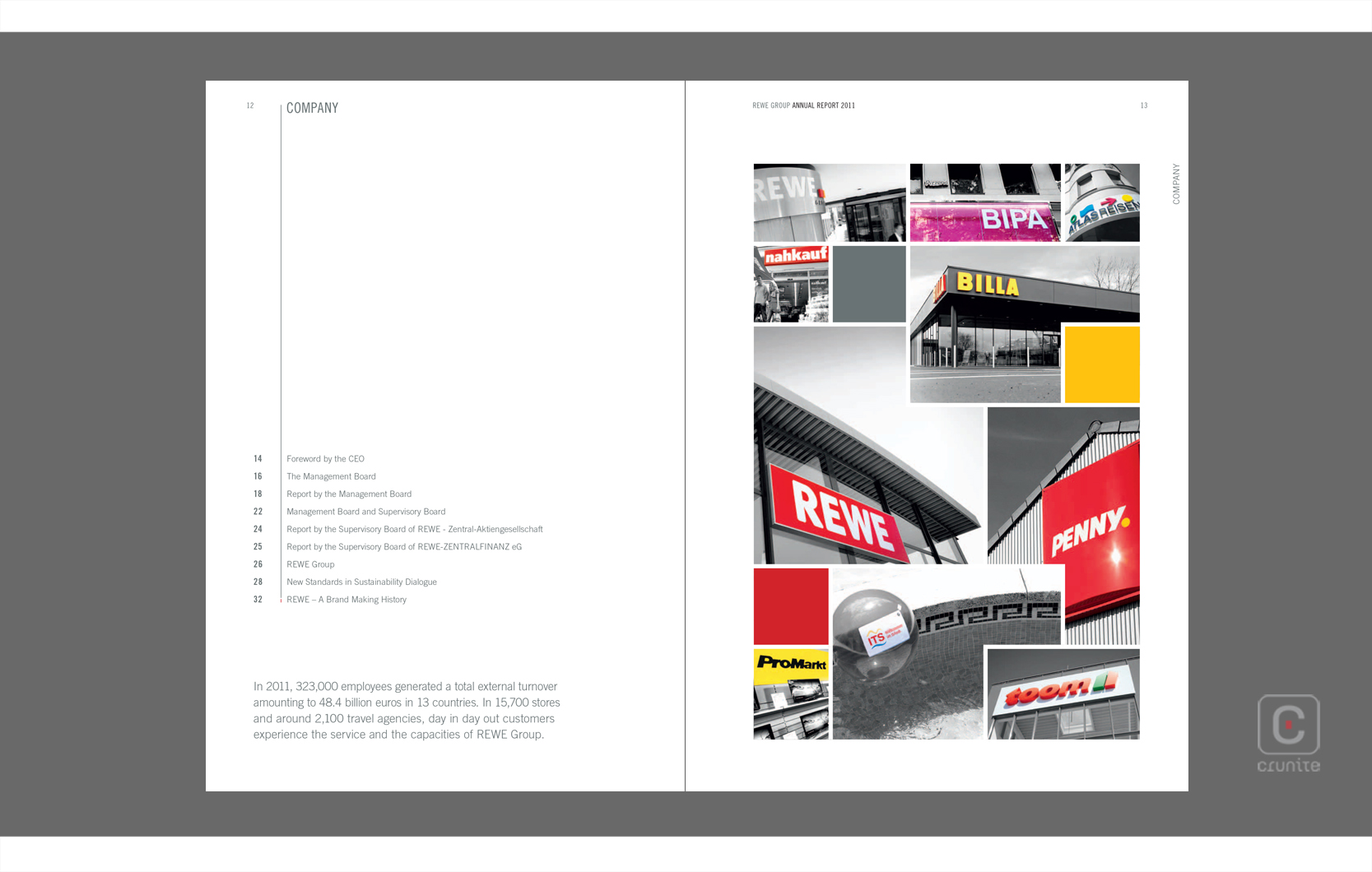
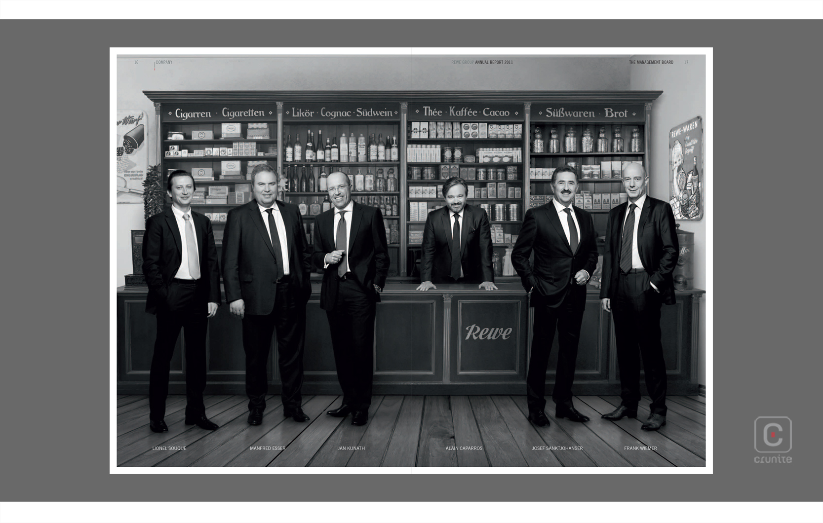
Image credits: REWE Group
Back![]()
![]()