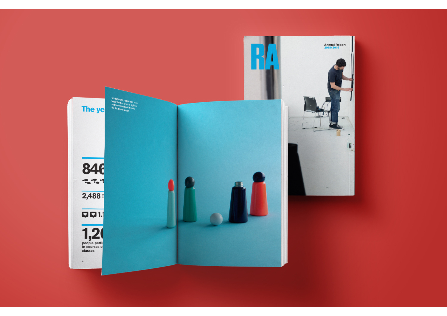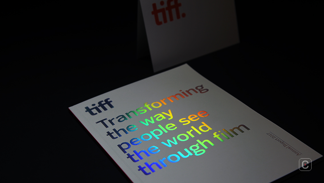
Adopting a compact 16.5×23 cm magazine style, TIFF simply makes a bold statement on the cover in rainbow hot foil against a matte white backdrop: “Transforming the way people see the world through film”. The spine and back cover continue the minimalist design with a solid red colour for the spine and a solid blue for the back cover – prominent colours throughout the report. Text is limited to no more than “TIFF” and “Annual Report 2017”.
2017 was a landmark year for the film industry. The biggest stories of the year revolved around women in the industry, and the impact was intense and indelible, and felt around the world. TIFF acknowledges this, referring to 2017 as the “year of the woman”.
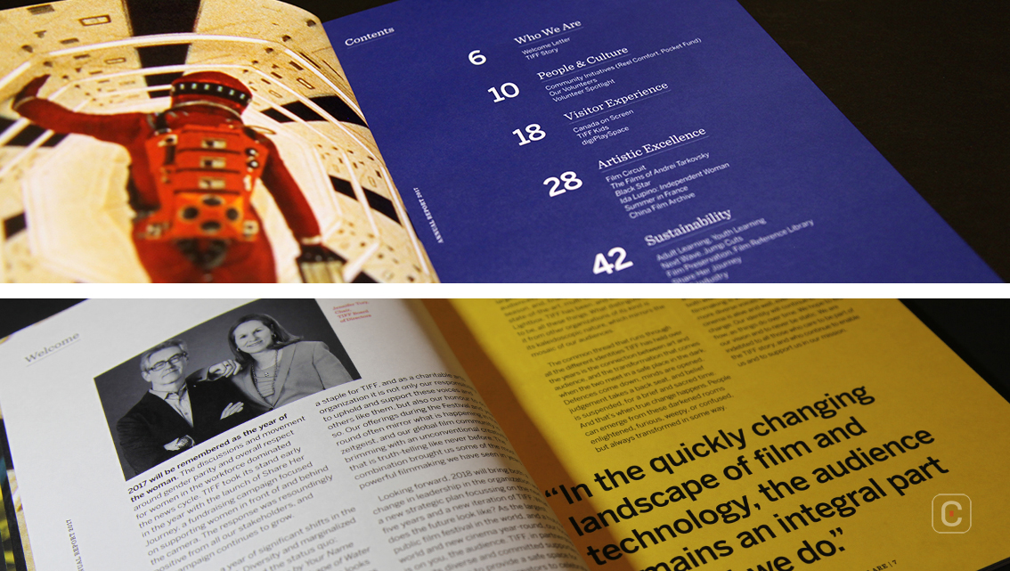
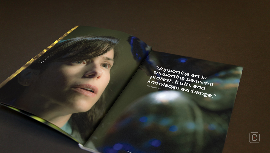
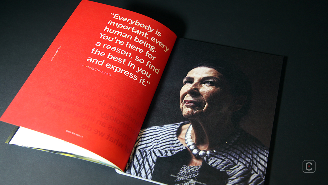
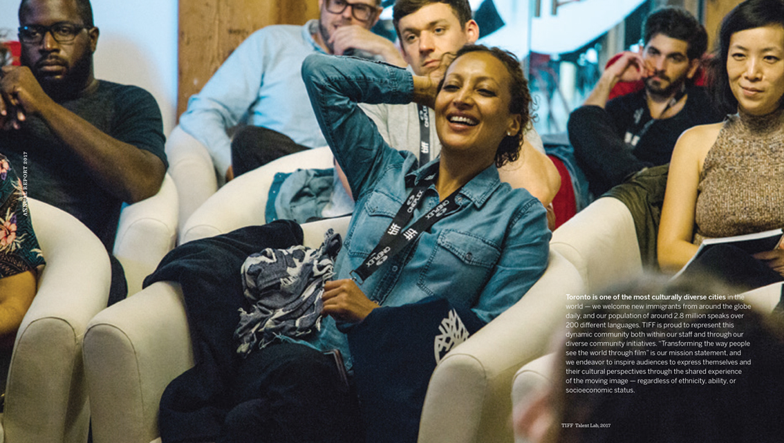
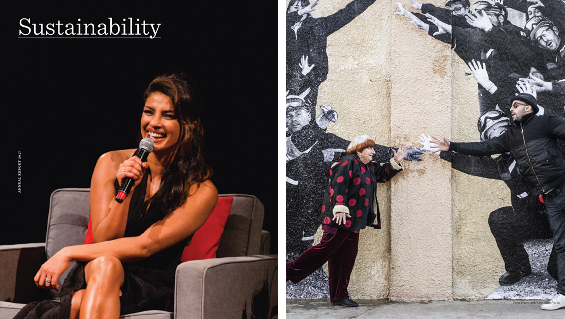
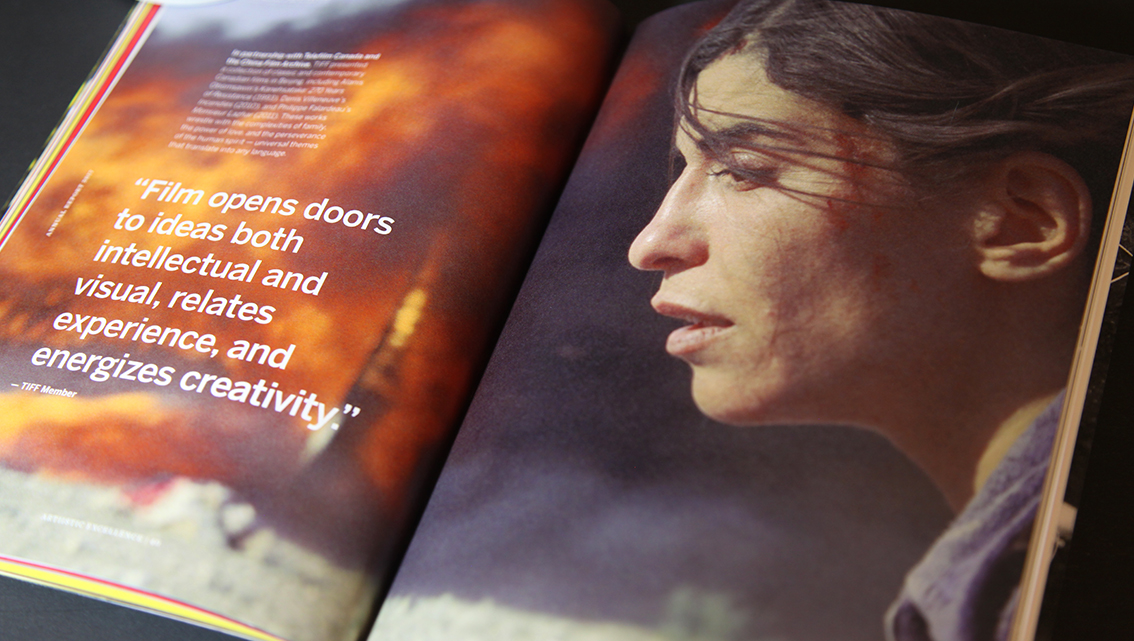
Scattered throughout the 70+ pages of the report are iconic imagery from films such as Stanley Kubrick’s “2001: A Space Odyssey” and Andrei Tarkovsky’s “Stalker”, and images of women in film. True to its magazine format, photography takes centre stage with behind-the-scenes photos of film crew in their element and audiences participating in screenings and discussions.
It particularly punctuates the section, “Canada on Screen”, the only section of the report written in English and French, each prefaced by the same photo elements in red and blue duotone.
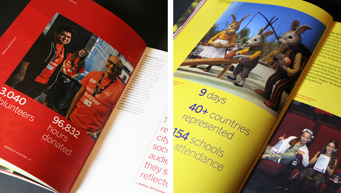
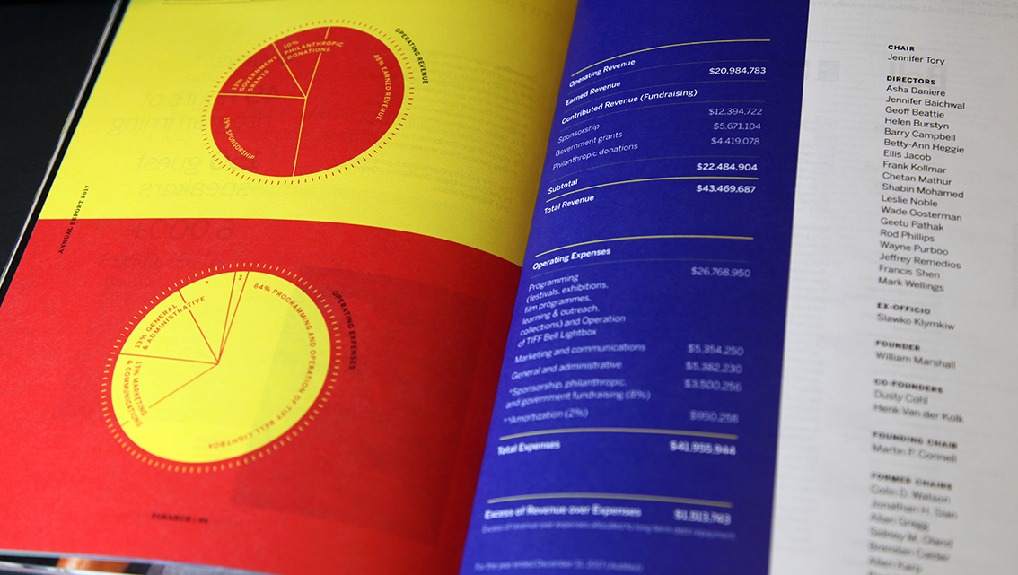
This is especially striking on the only two pages of the report that cover financial performance, playfully balancing the blunt numbers and pie charts with splashes of bold, vibrant colours.
As a marketing tool for an organisation operating in a creative industry, the TIFF Annual Report represents the unbridled creativity and aspirations of its key stakeholders, offering readers ample information about TIFF’s efforts in 2017.
![]()
![]()