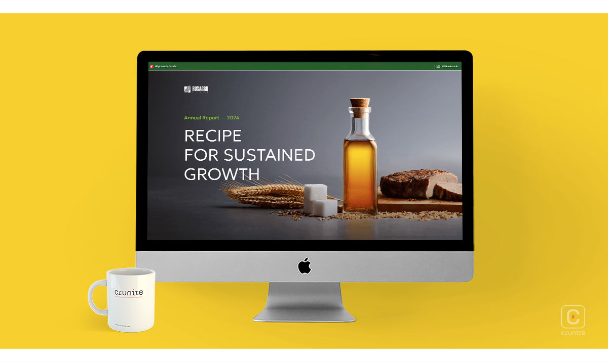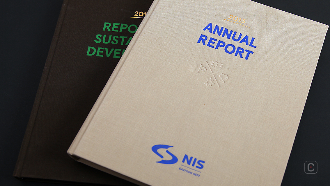
NIS is an energy company in the Balkans with its sights set firmly on becoming the energy leader in the Balkan Region, a message strongly conveyed in it’s 2013 Annual Report. The report is split into two parts; the Business Report and the Financial Statements and Auditor’s Report. These sections are wrapped neatly inside the report’s design which is centred around that of a book. Similarities include a canvas-bound cover, which in this case produces a satisfying tactile effect, and high quality uncoated paper for the inside pages completing the high quality print finish.
Perhaps the choice of a book theme for the report stems from the perception that books carry status and are perceived as a quality item to be cherished, or it could be that it’s volume at more than 200 pages is more a kin to a tome than a magazine and certainly in much need of its contents and glossary pages.
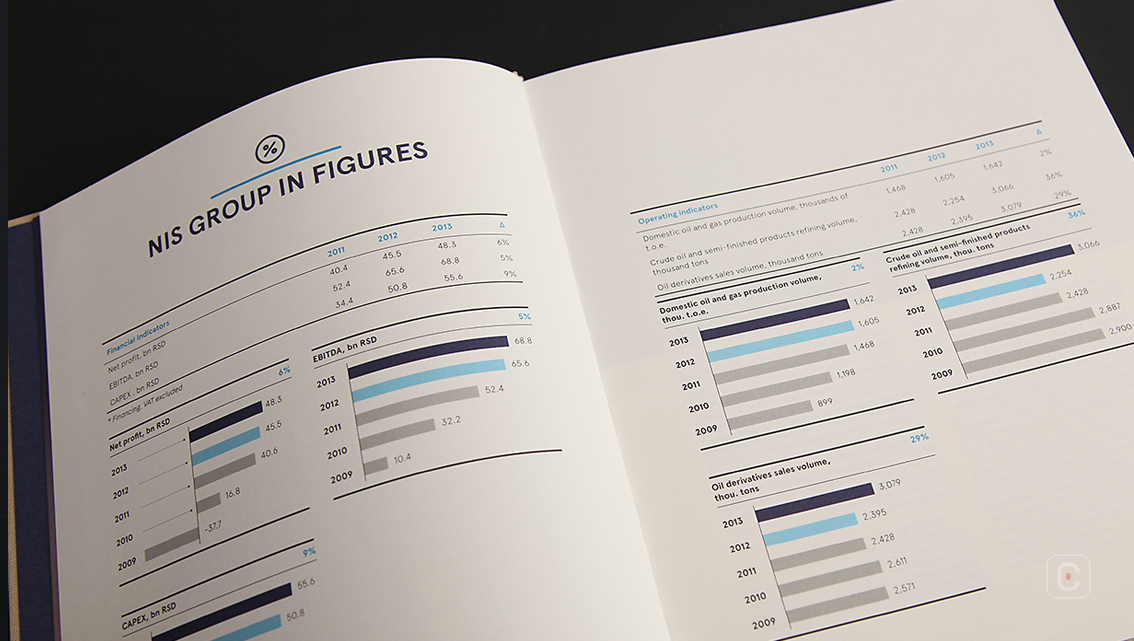
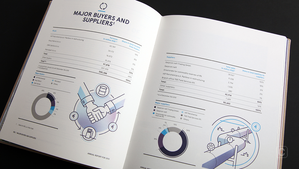
Of course size is not everything. The company achieves a great annual report by designing pages filled with interesting infographics, concise content structure and great photographs. The graphs are simple and neat making the data easier to interpret.
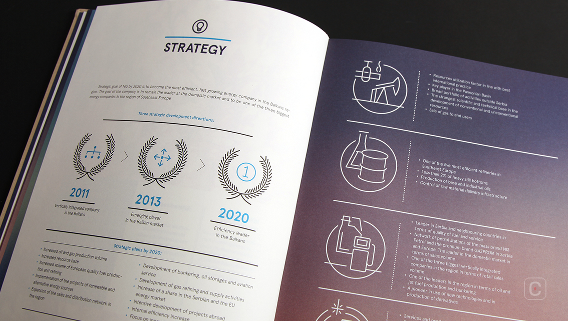
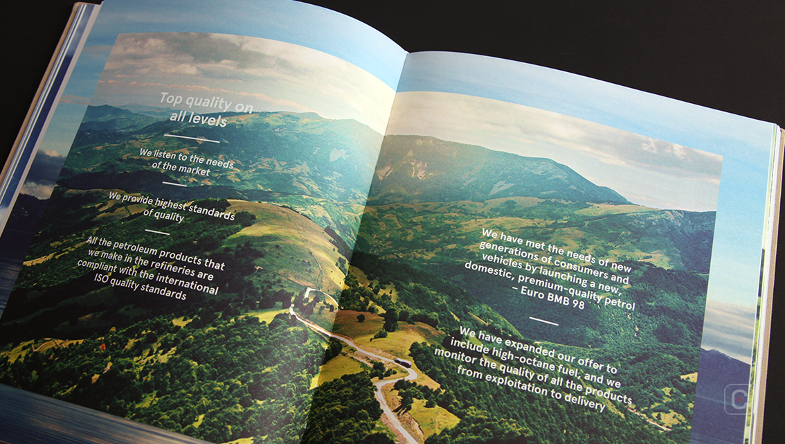
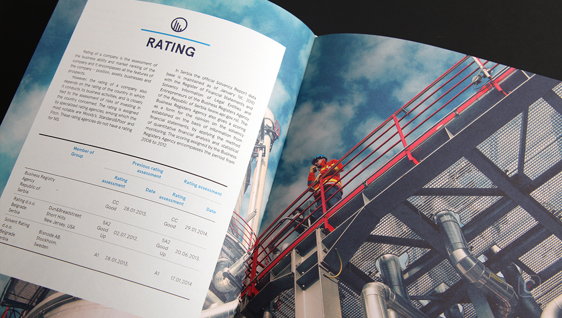
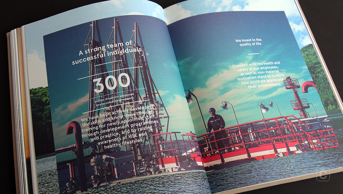
The laurel wreath, a symbol of victory and honour, is used to highlight the company’s strategic goals. And full-page photographs similar in style to a high-end magazine are scattered through the report.
The report makes use of mixed weights of a modern font to enhance the hierarchy of the text and form some nuance. Of course easy-to-read copy is imperative when you are trying to convey a message so if the fine font used for the body copy works well on white backgrounds but is not quite up to the task on more complex backgrounds that’s an issue. In this report the font is not quite robust enough when it appears over the light tones in a background image. This hampers the visibility of the overlaying text and ultimately impacts on the reader-friendliness of the document.
Despite a slight readability issue, the NIS Annual Report still offers the company the perfect chance to use it as a marketing tool thanks to its in-depth information, detailed facts and good design.
Back![]()
![]()