IBM’s 1957 annual report is a model of balance and restraint. Designed by the brilliant modernist graphic designer, Paul Rand (1914-1996), this report is well worth studying.
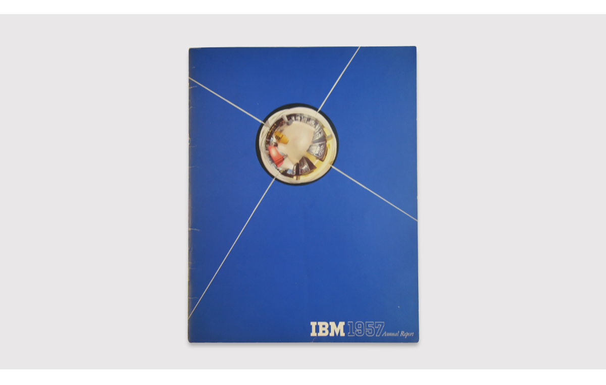
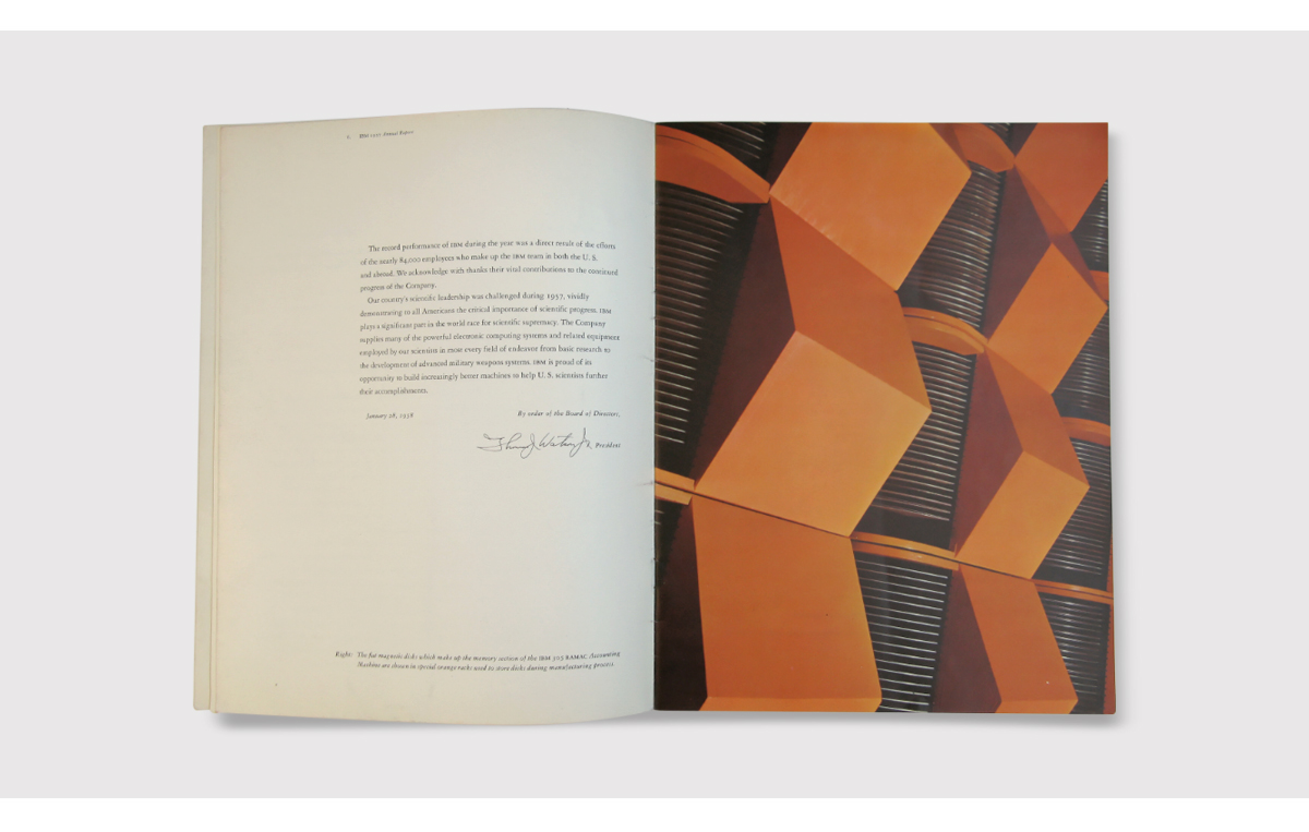
Rand was a proponent of the International Typographic Style (Swiss Style) and while he relies on elements of this, it is not a slavish reproduction. For one thing, he makes photography the key to the design, rather than type treatments. Here, Rand makes use of carefully composed, saturated images.
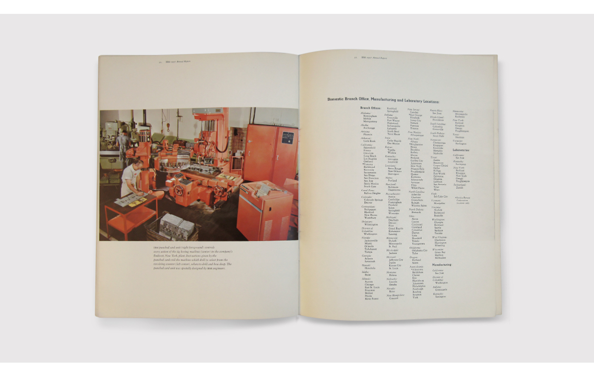
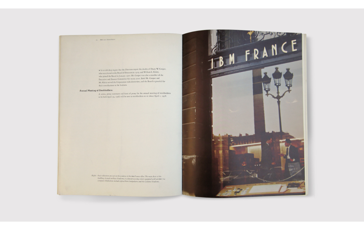
Photography plays an important, dual role in this report. By abstracting elements of the technology, it shows the strangeness of computers. At the same time, by highlighting the widespread use of computers in society, Rand makes the strange mundane. To pull off this juggling act, the design uses detailed, tightly-written captions for each image – something modern annual reports often omit.
The paper is an off-white, uncoated stock and this lends itself to the saturated photographs selected by Rand and IBM. Type treatments are restrained – Rand opts for IBM’s slab serif for titles and an elegant serif for the body text. The page grids are asymmetric in keeping with the Swiss Style, and captions are allowed considerable flexibility.
It’s astonishing what an annual report can be, in the hands of a master. This slim, 32-page report, with minimal flourishes or gimmicks offers much to the keen designer.
Images: ⒸPaul Rand
Back![]()
![]()