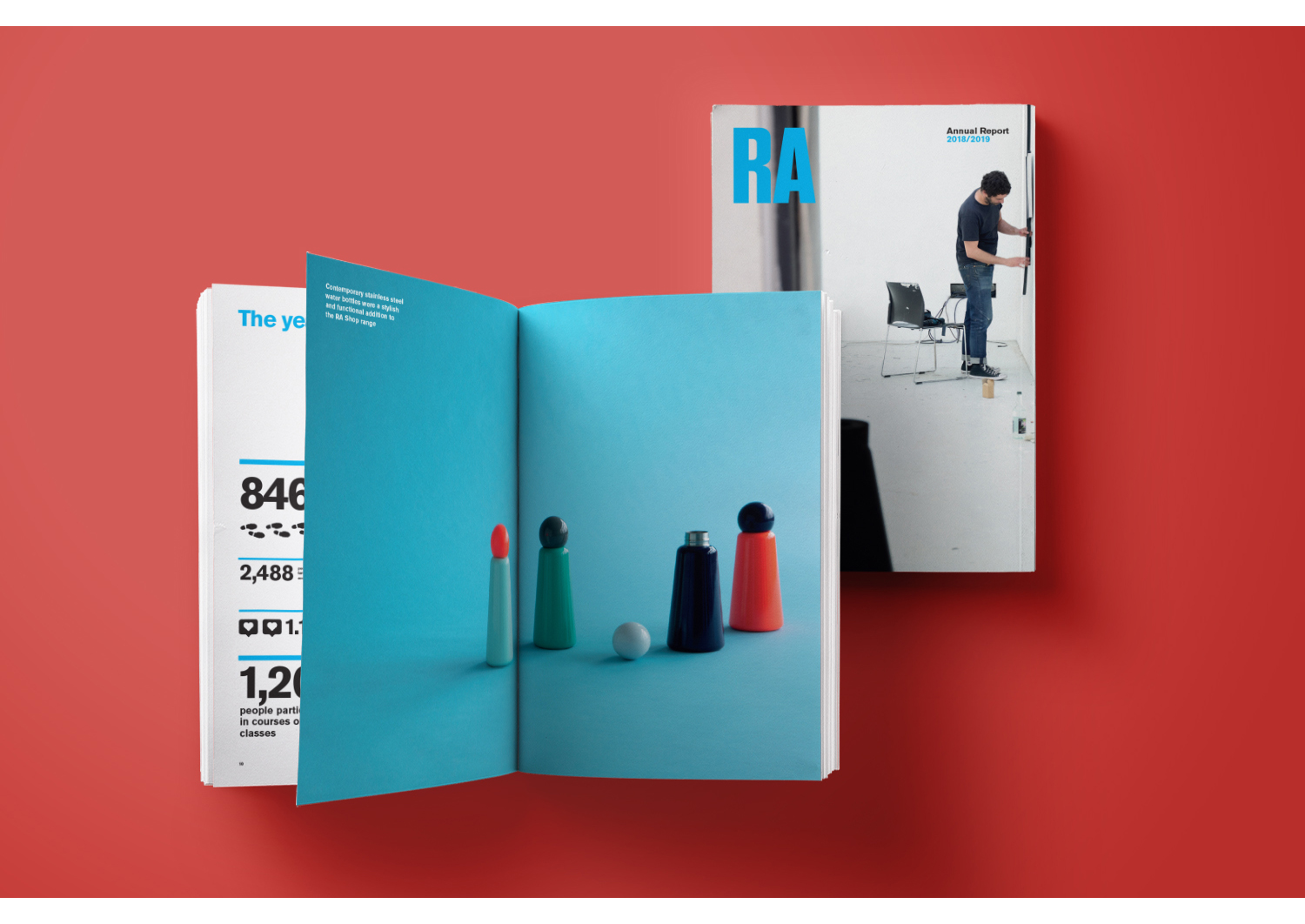
Ted Baker is a British high-street fashion brand that made a firm impact on England and later, the world, in the 90s. Its annual reports in the 2000s were frequently clever and witty (see our coverage of the 2005 report and their 2003 report, as part of this series. Their 2022 report, while good, is not at the same standard as their earlier reports. This is possibly to do with a downturn in the company’s fortunes, which culminated in the 2022 sale of the brand to the American company that owns Reebok.
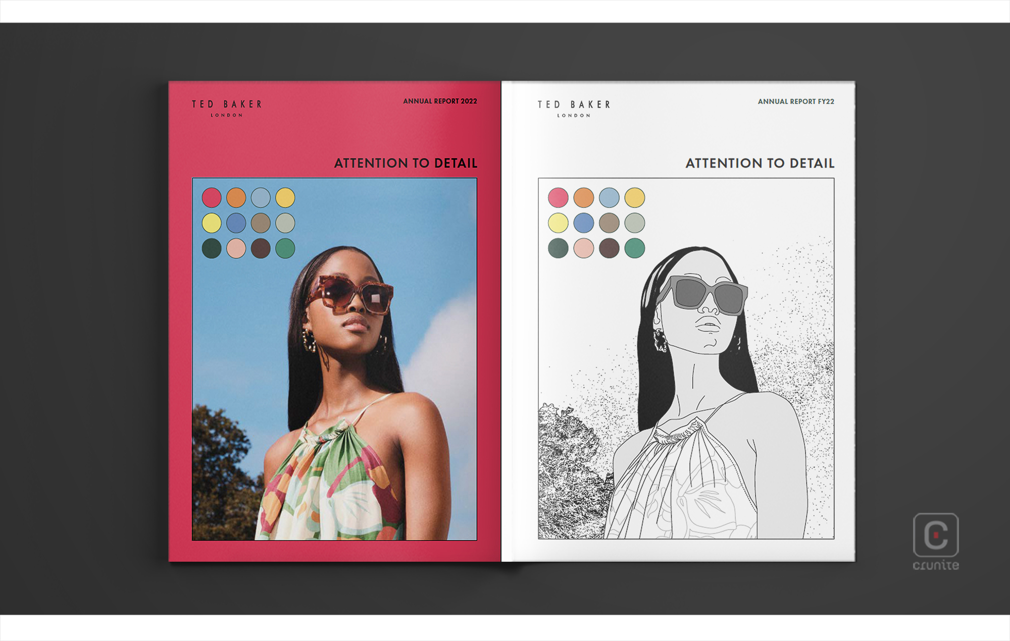
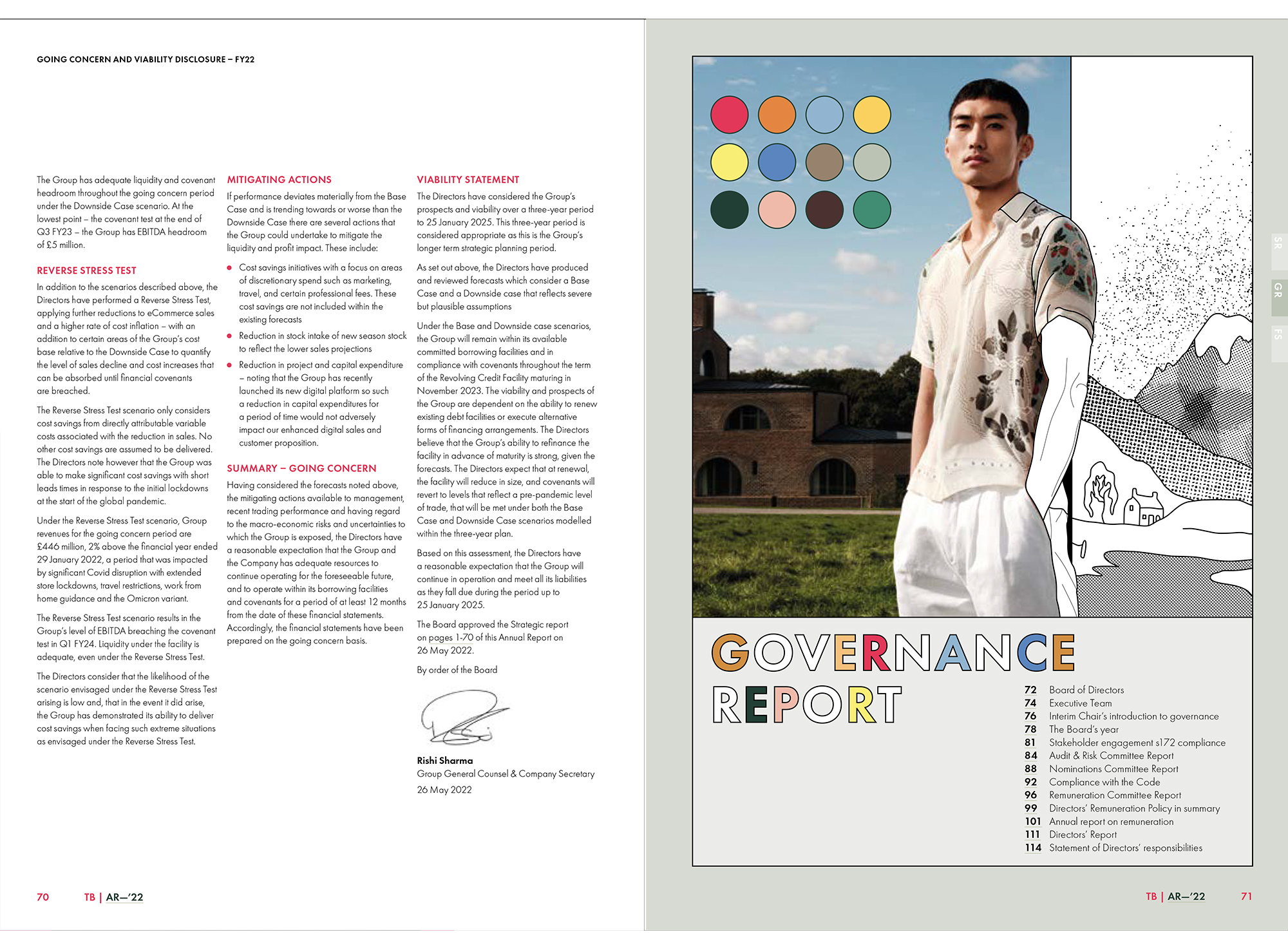
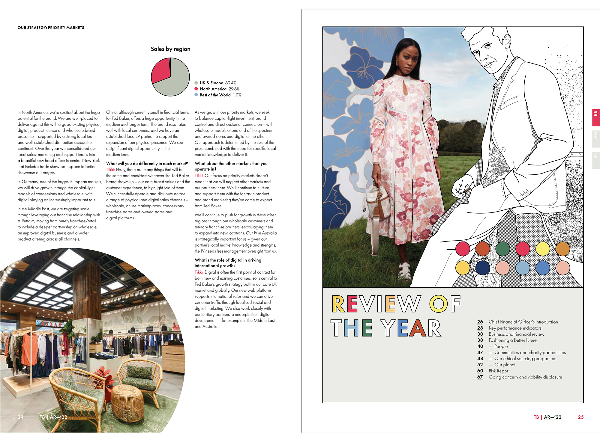
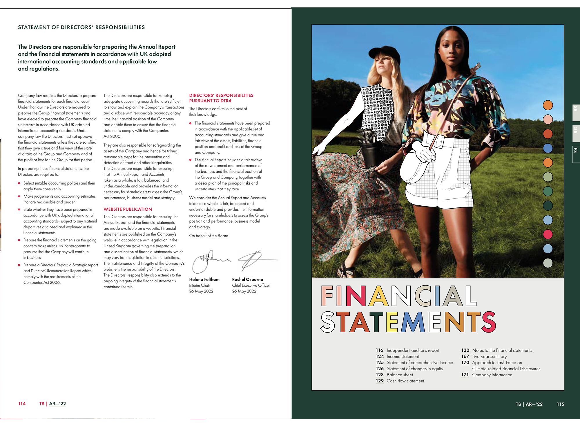
The 2022 annual report is titled ‘Attention to Detail’. Curiously, it doesn’t do much of this in terms of its design. Maybe the use of a circle as a design motif is a nod to the title? What the report does do well is make effective use of its highlight colour (a deep pink that verges on red).
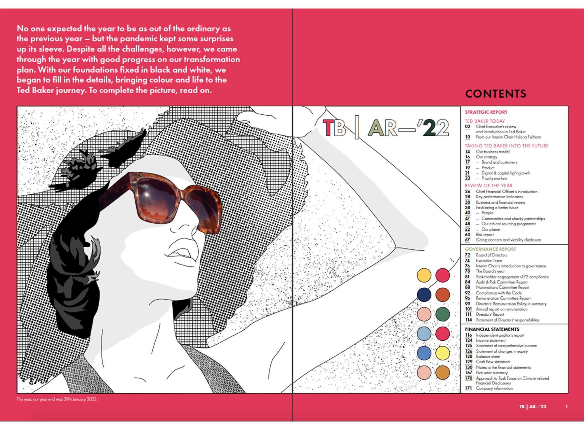
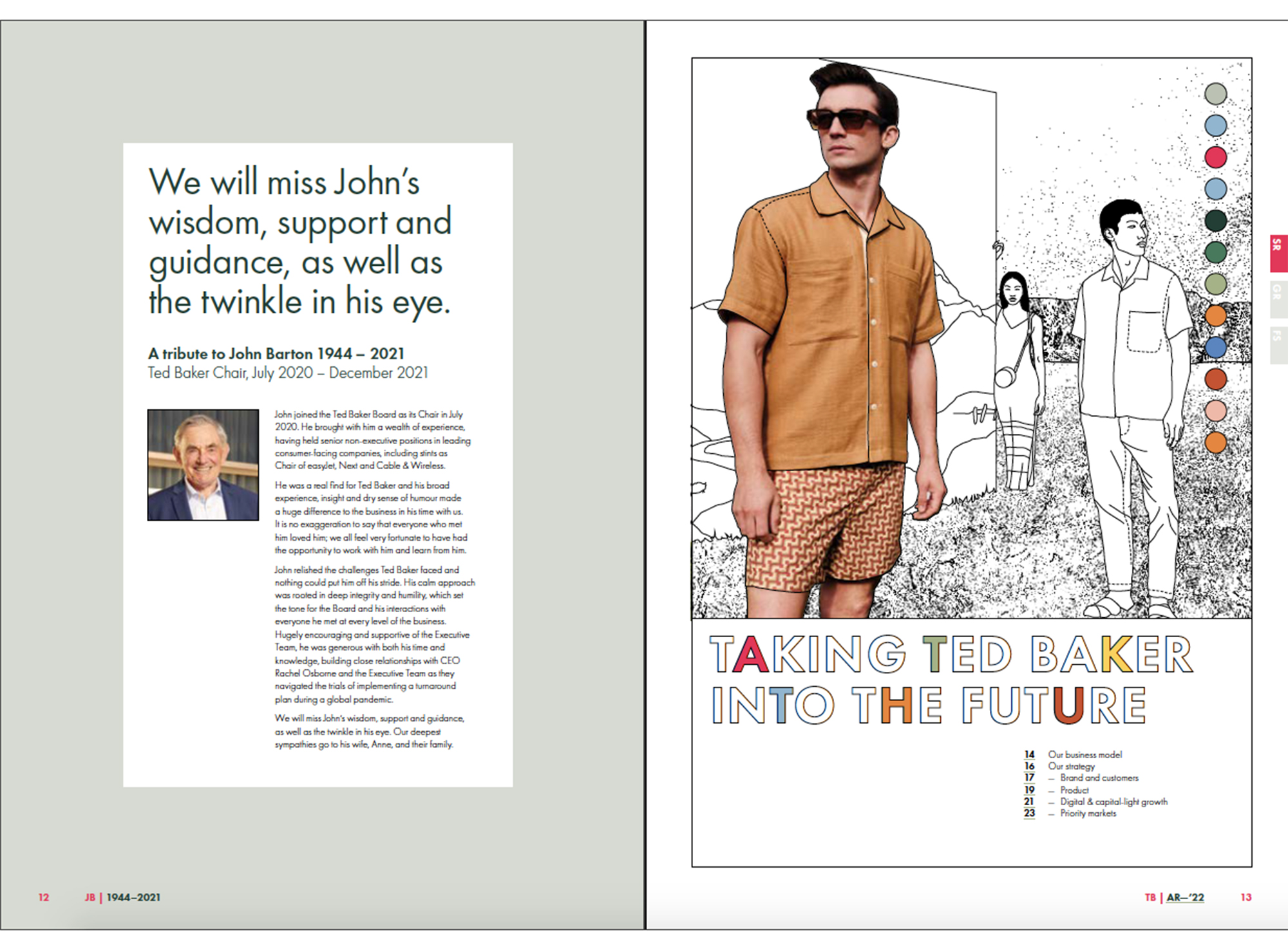
The reader is primed to notice the colour because the designers (Falcon Windsor) use it on the first three pages of the report in generous quantities. And once primed, the reader sees the colour wherever the designers have applied it, regardless of how small the application.
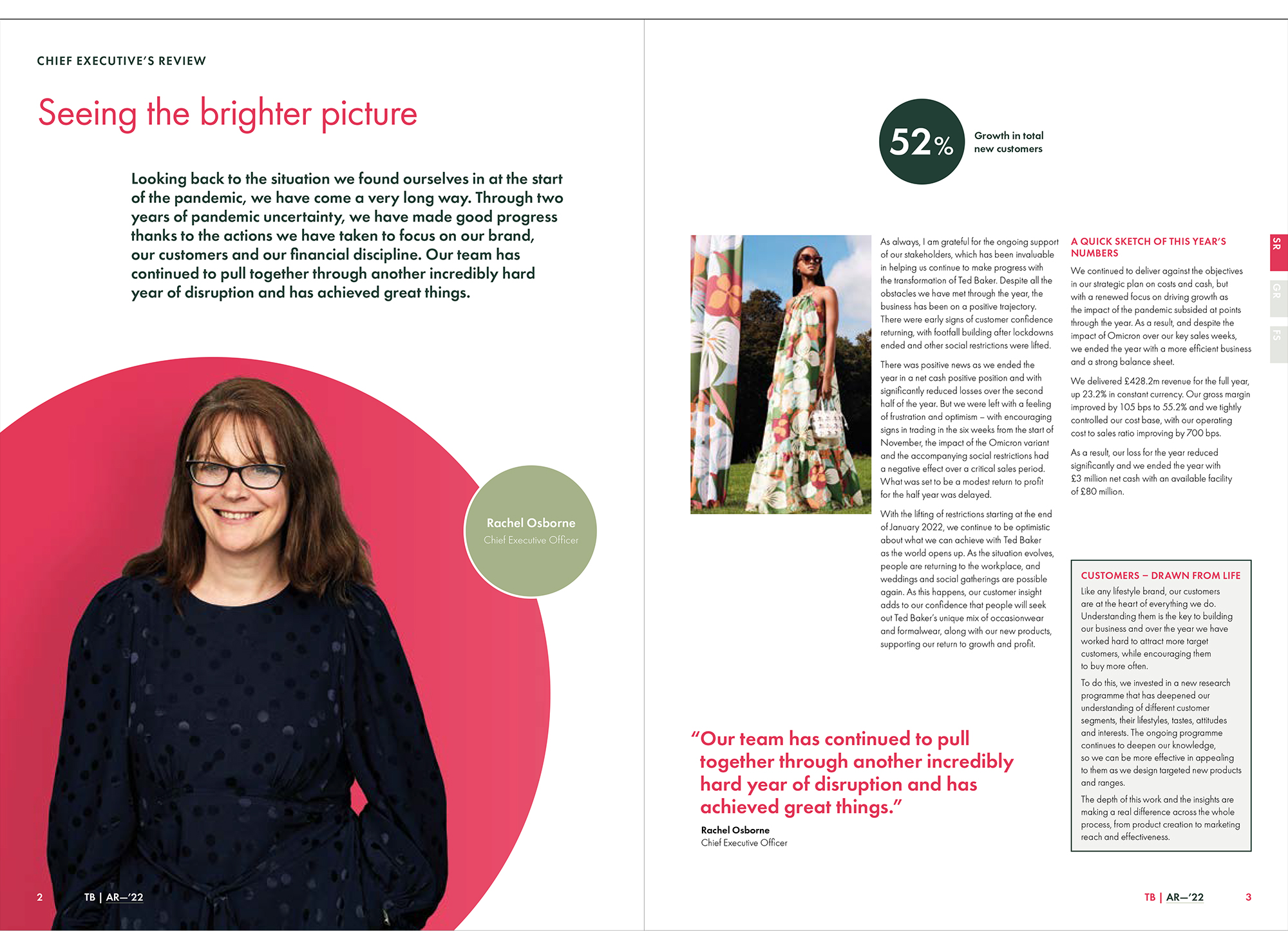
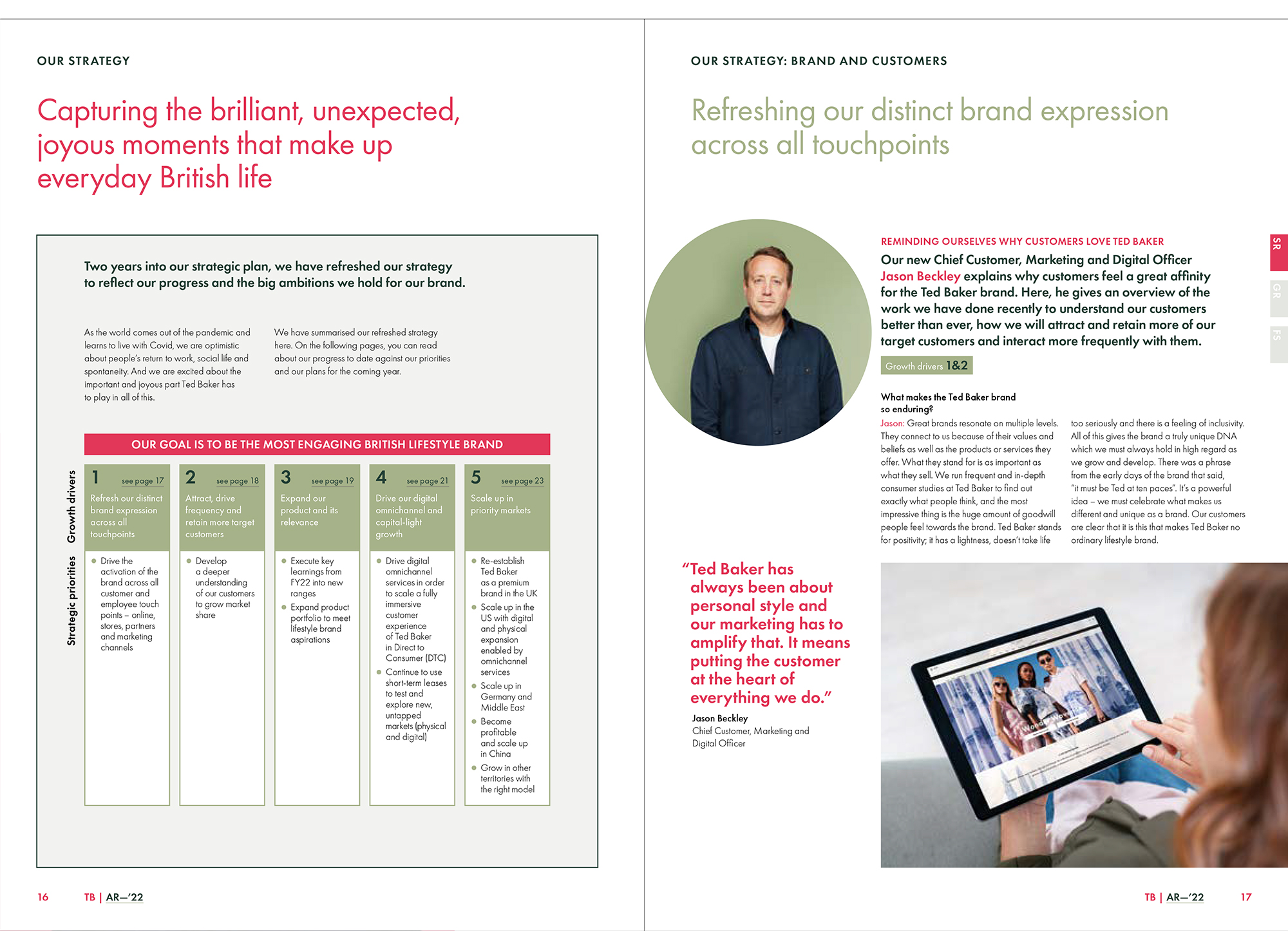
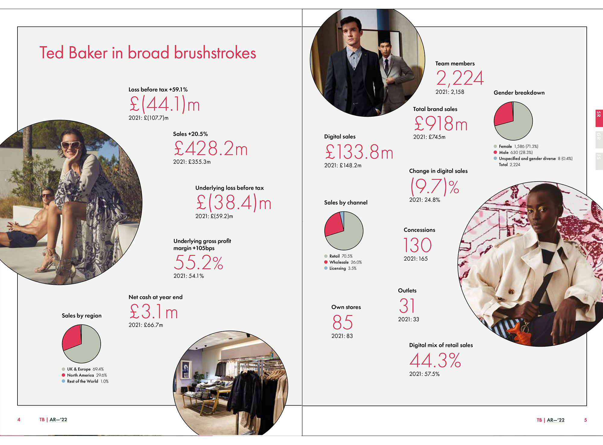
The colour is used in all sorts of sensible places – titles of sections, subtitles, pull-quotes, key financial numbers, bullet points, in charts and graphs, and for page numbers. The only misstep is when it is applied to brand’s initials, a ‘TB’ which appears on every page, for no clear reason.
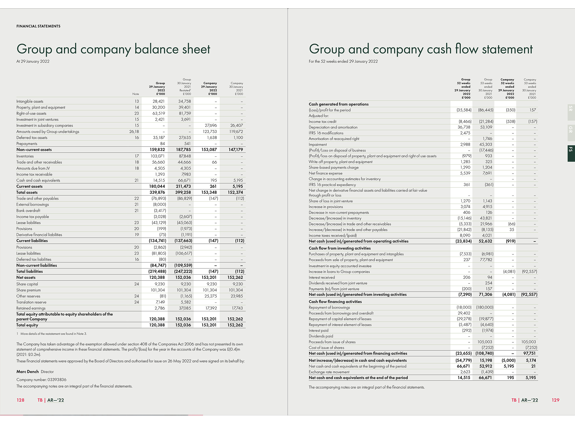
In the financial section the highlight colour is paired with a pale, warm-grey tone, where they work well together. It also makes the white of the paper stock function as an even more eye-catching highlight colour – useful to direct the eye towards specific, key columns in the accounts.
2022 was a difficult year for all of us and many annual reports were subpar, for understandable reasons. Here’s hoping Ted Baker gets back to the heights of its 2005 report soon.
![]()
![]()