The artist Paul Klee once said, “A drawing is simply a line going for a walk.” The 2013 annual report of Hermès International, the famed French luxury goods manufacturer, is a testament to how line and colour can unite to create eye-catching illustrations.
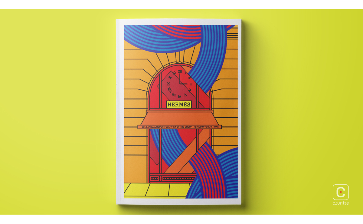
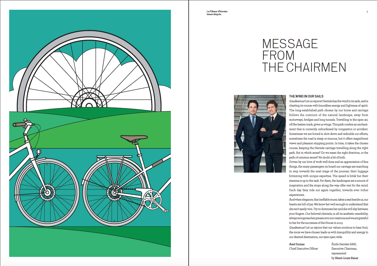
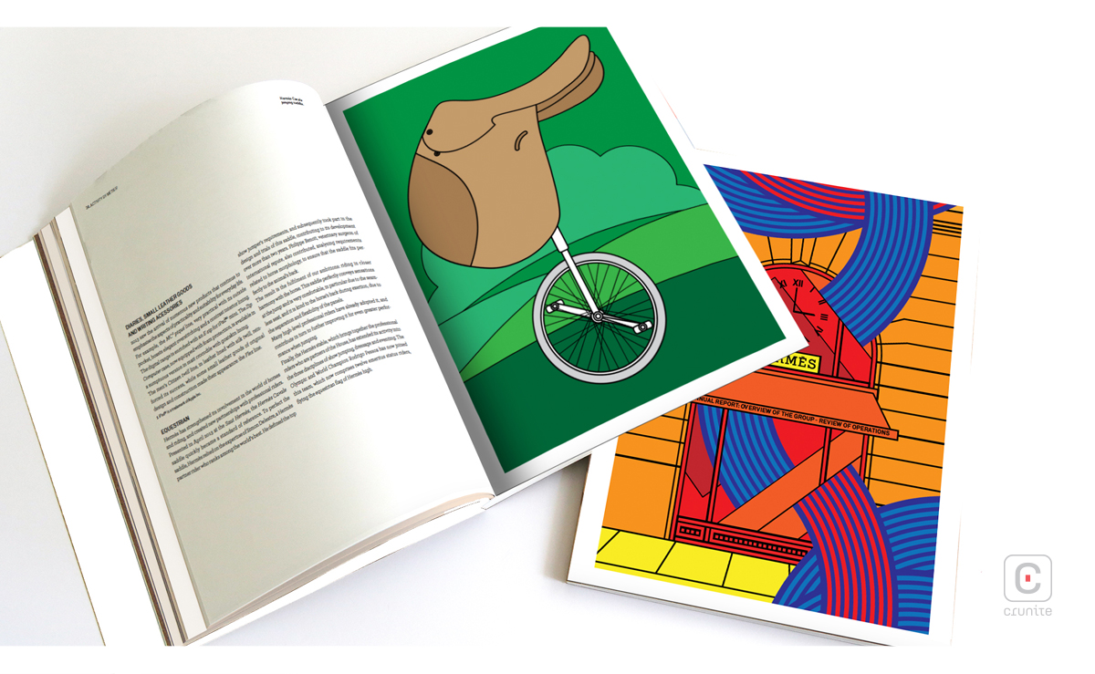
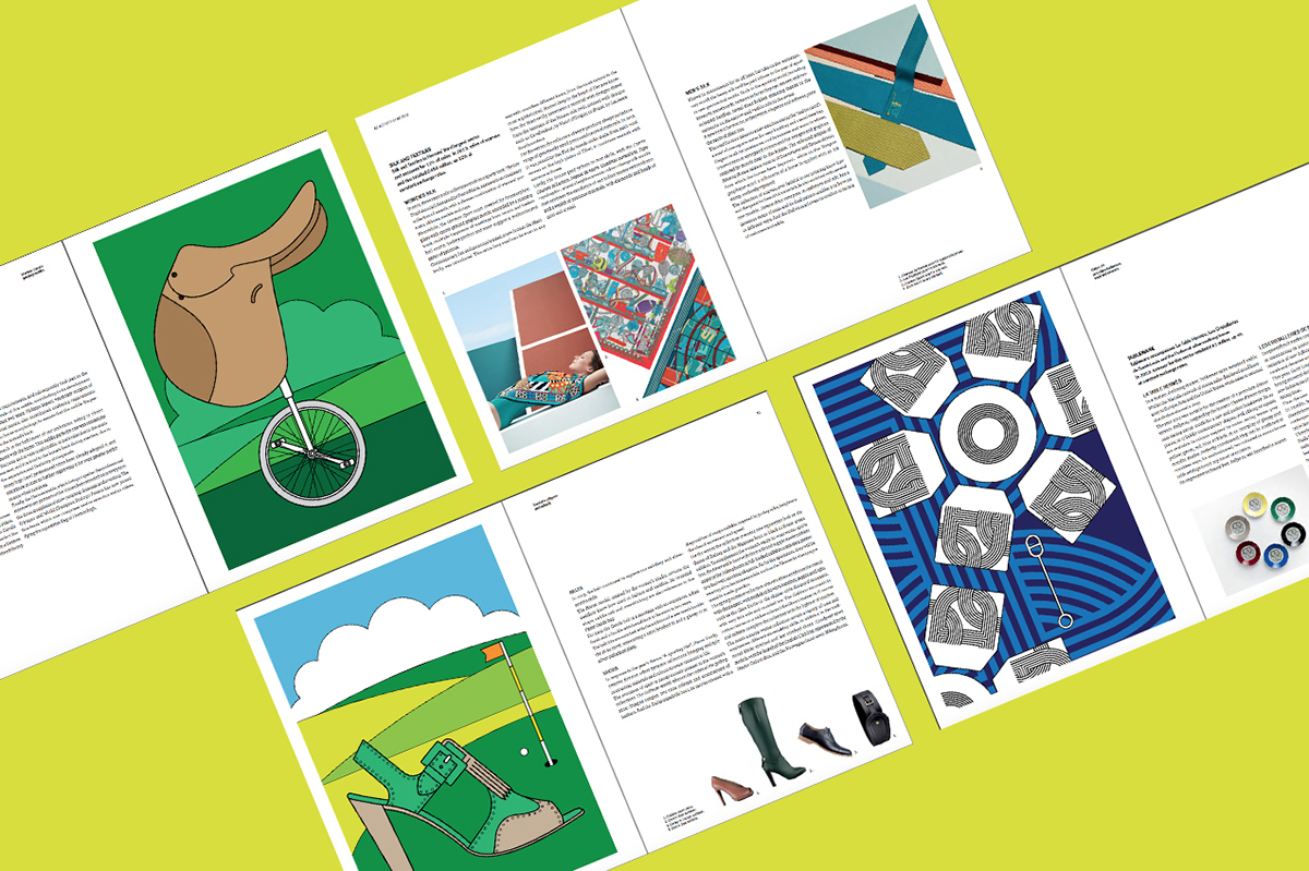
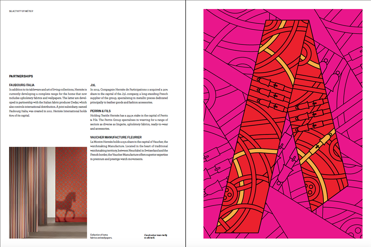
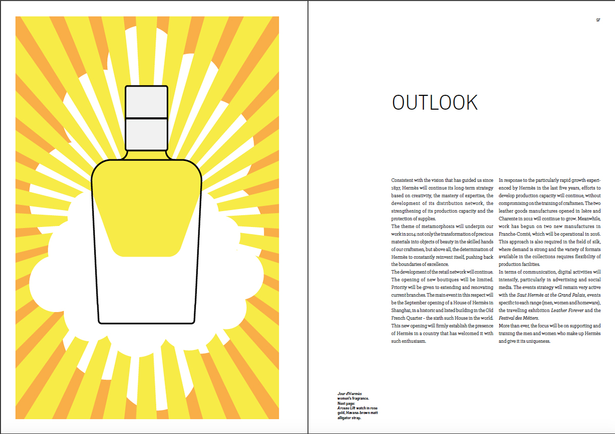
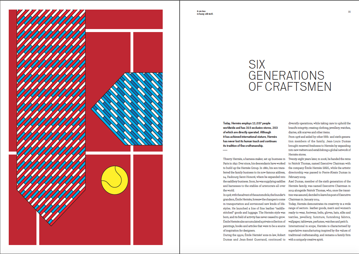
The flat illustration style used throughout this report showcases the diverse products of the company. Colour used throughout is vibrant and really pops. In fact, every other element in the report pales in comparison. Each of the illustrations fill a page, as though to really highlight each product as much as possible.
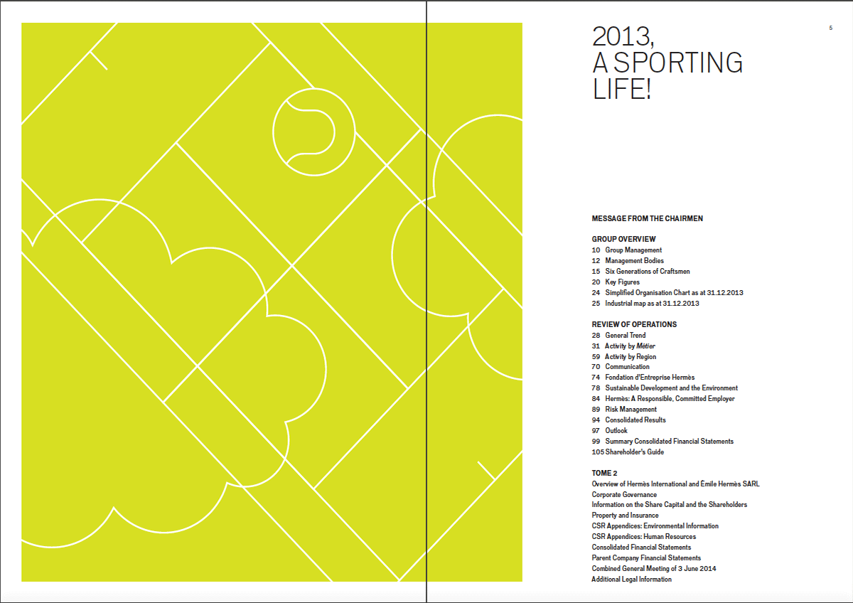
Slightly muted green separator pages also seem to display – with minimal and creative use of line – a tennis court, soccer field, race track, etc. to match the theme for 2013: a sporting life. A notable feature present in many of the illustrations is green fields and a cloud or clouds, possibly as a subtle nod to Greek god behind the company name.
Text is minimal in the non-financial section; this allows for the illustrations to be the real hero of the report.
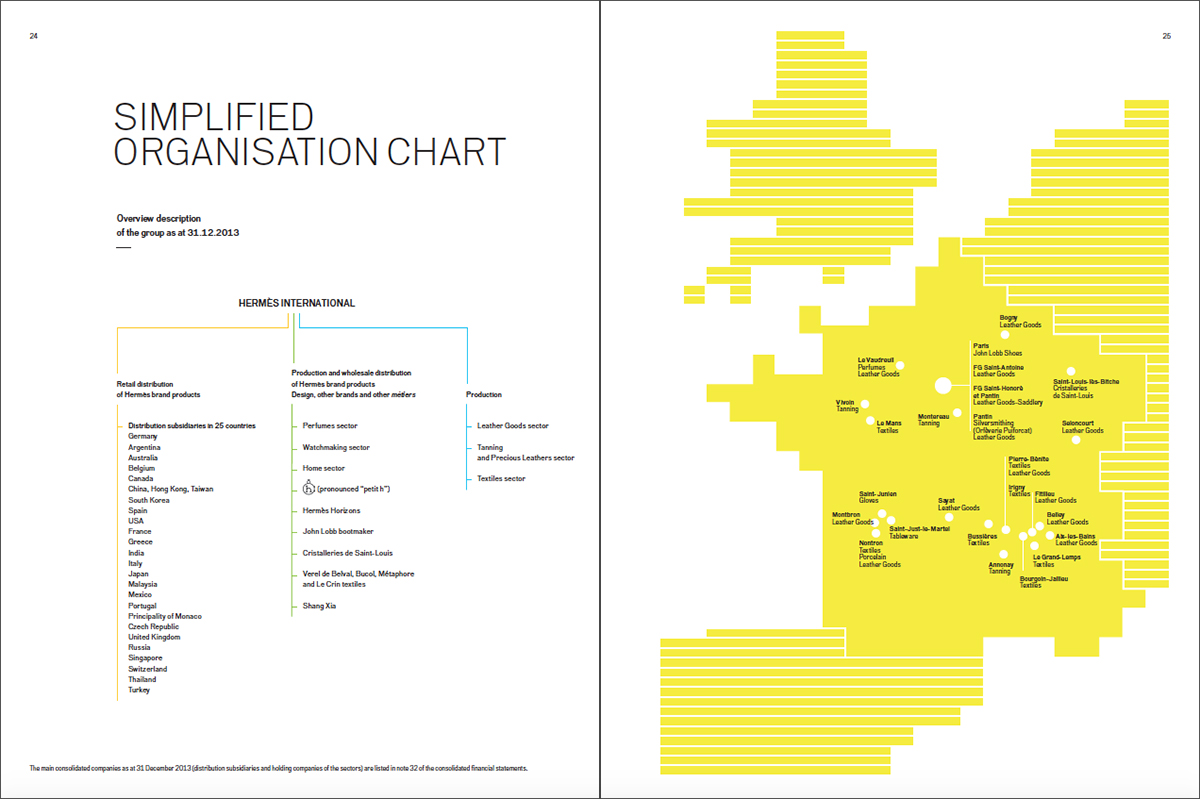
Line is used in all illustrations as straight or curved forms, in different thicknesses, and provide so much dimension even in the flat illustration style. Maps also have been created using line and are in a vibrant yellow. On page 25 is a map of France, while the rest of the maps are regional and thereby, a little easier to identify.
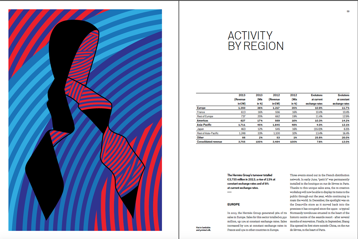
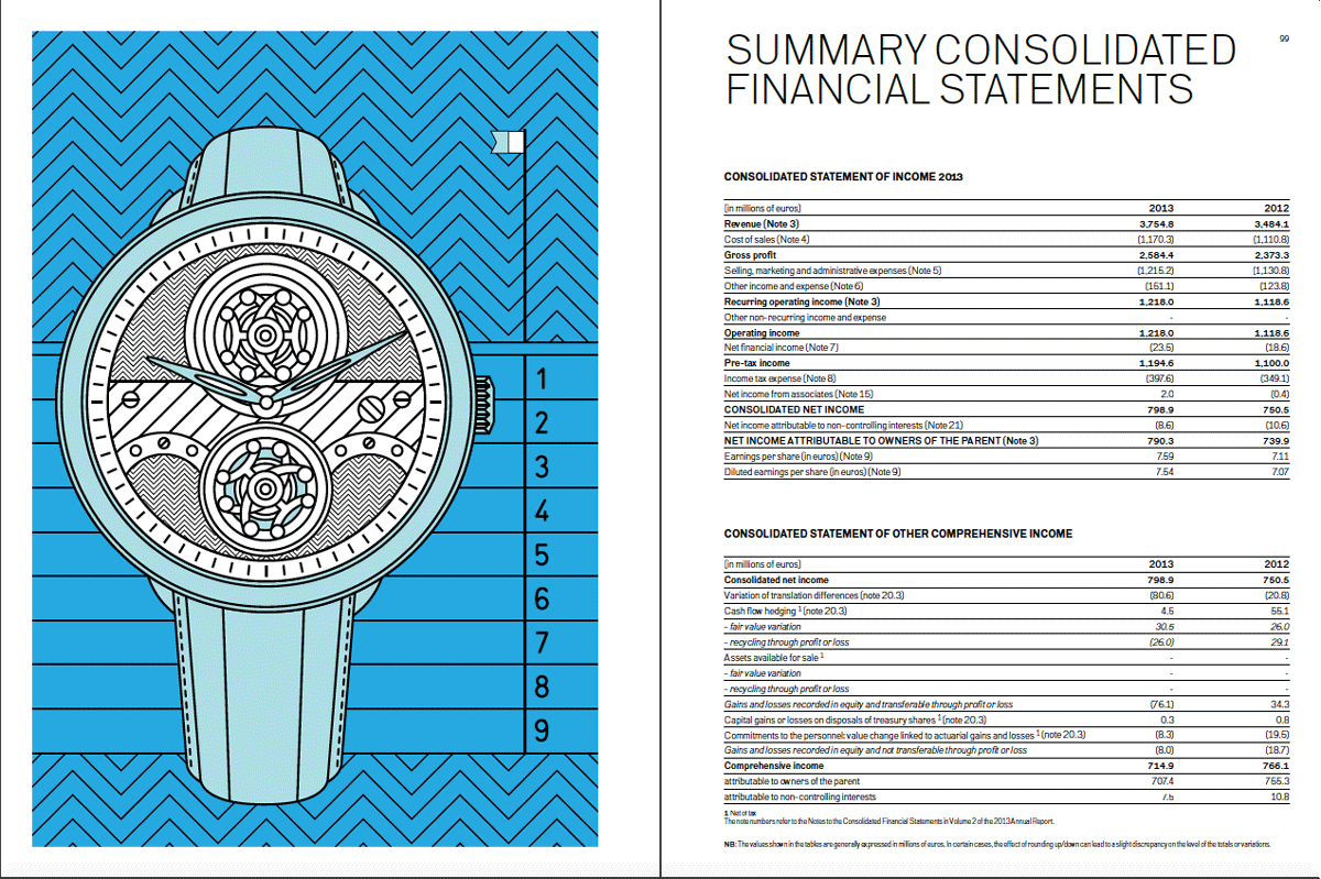
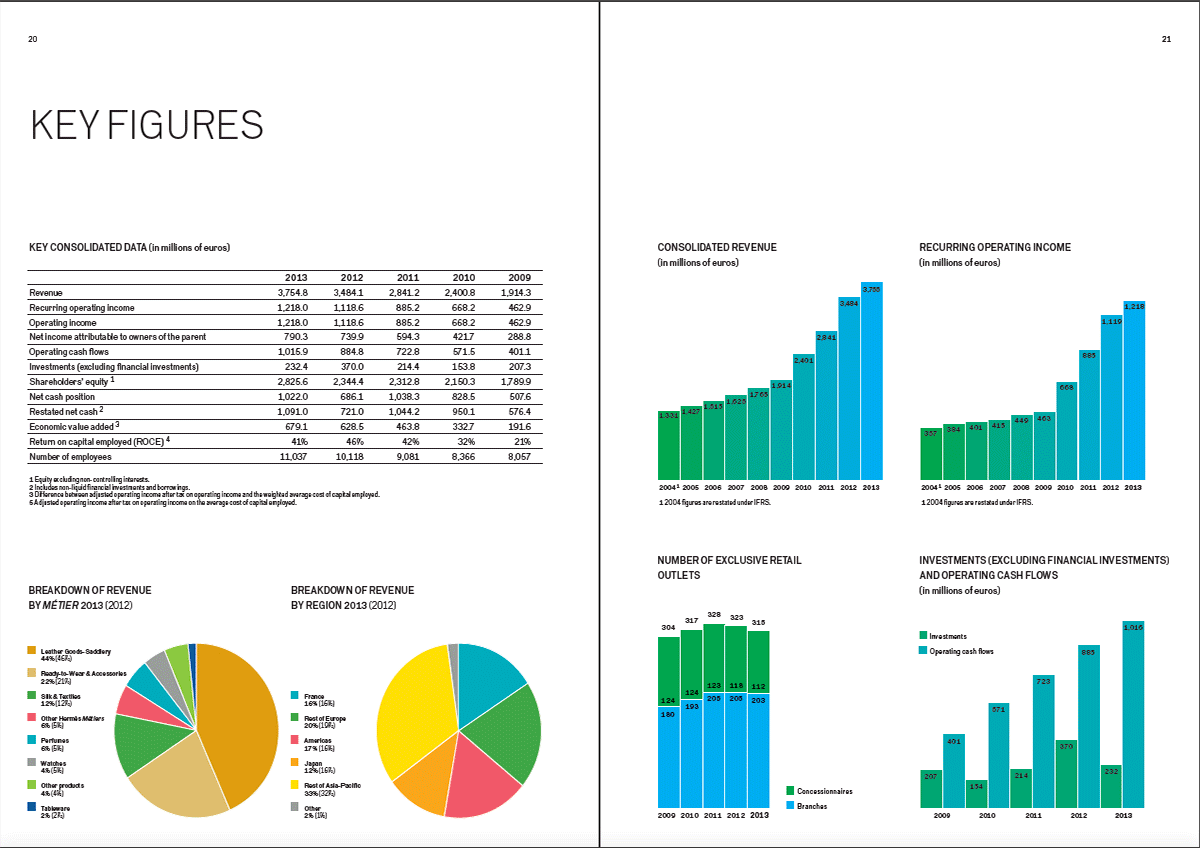
While there are smaller photographs of products as well, they do not match up to the beauty of the illustrations, and it seems intentional for it to be so. Similarly, data representation is colourful but not too much, so that illustrations are still highlighted to a larger extent.
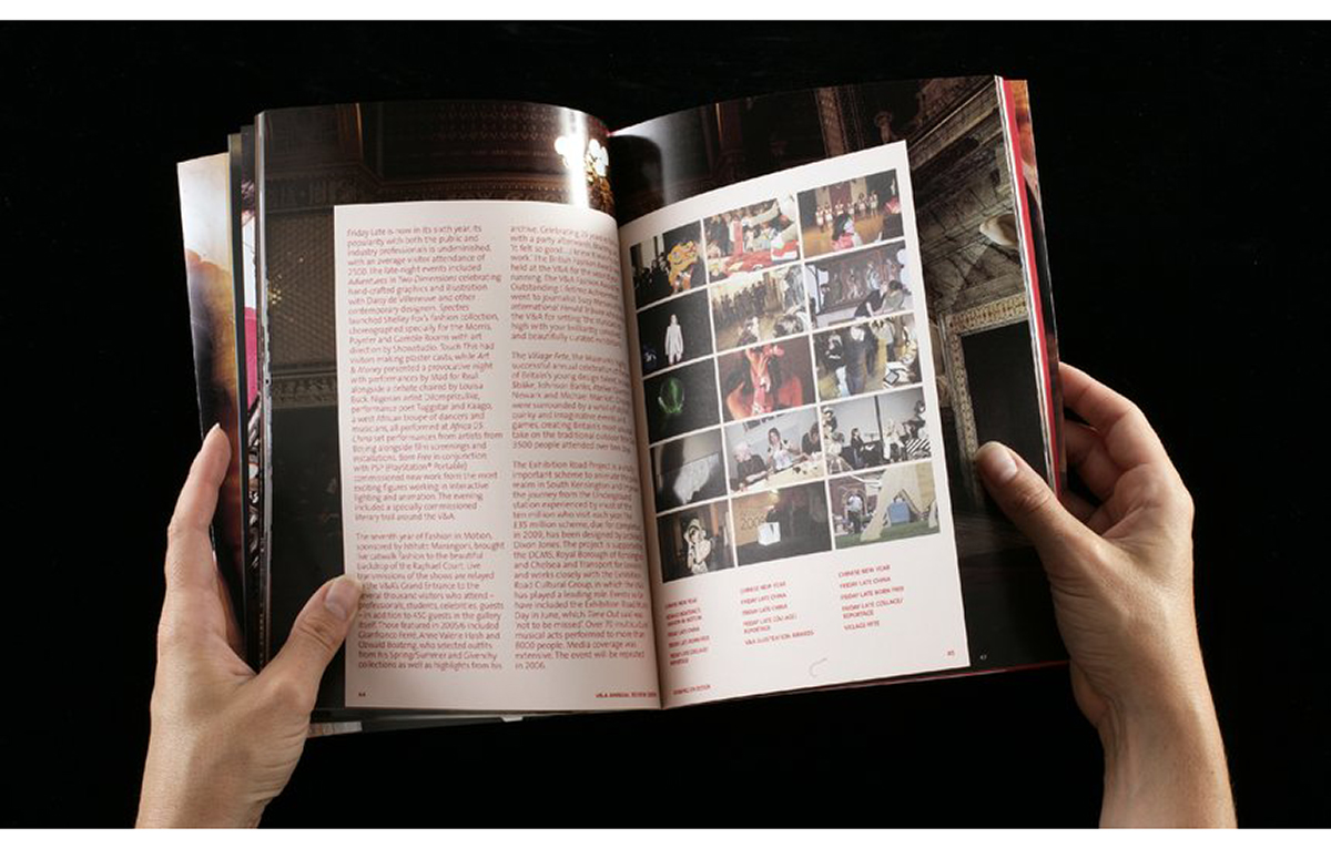
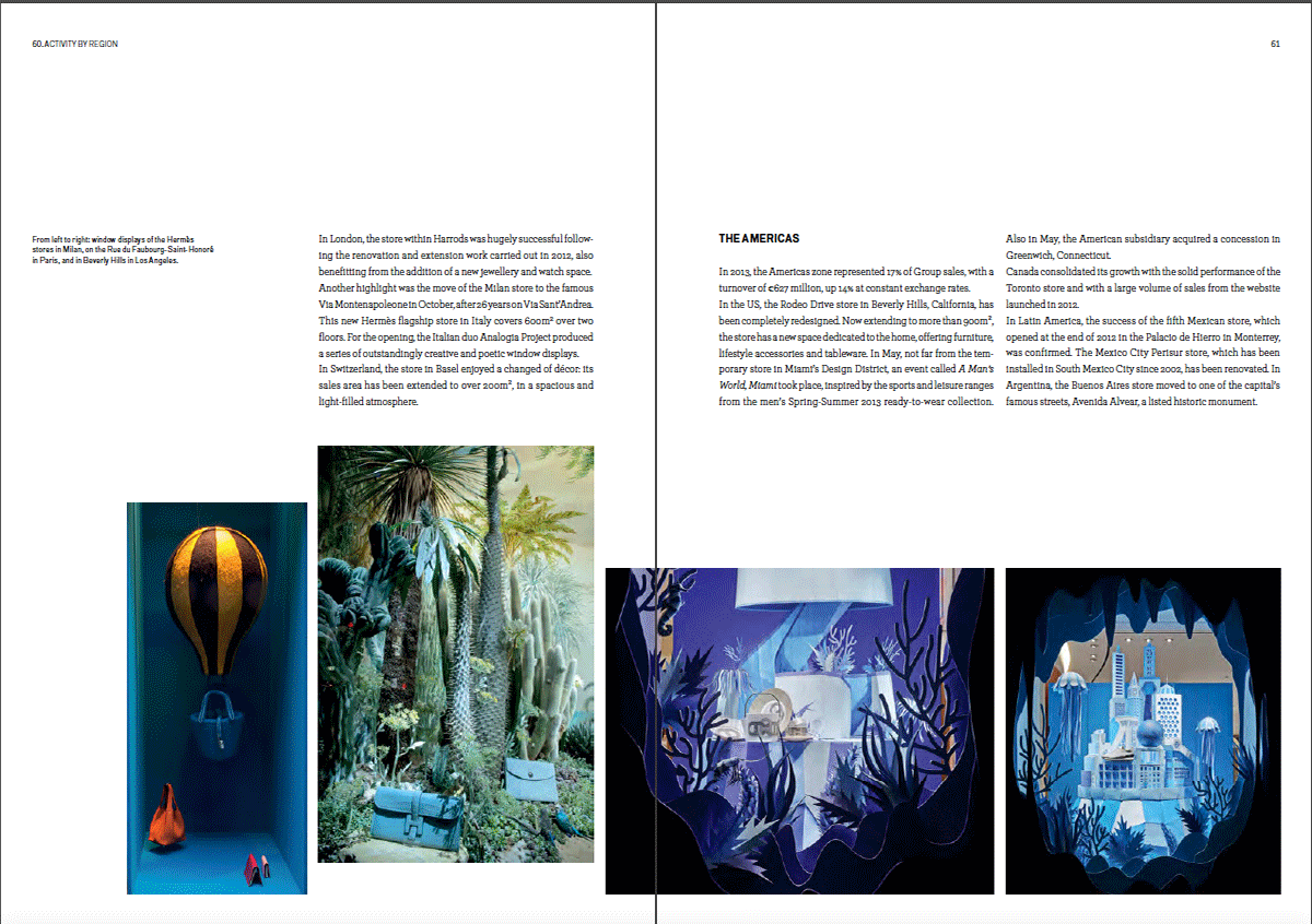
Photographs that interest the reader are the display windows of the company’s retail outlets around the world – their poetic arrangements are attention grabbing, presenting a unique brand character.
![]()
![]()