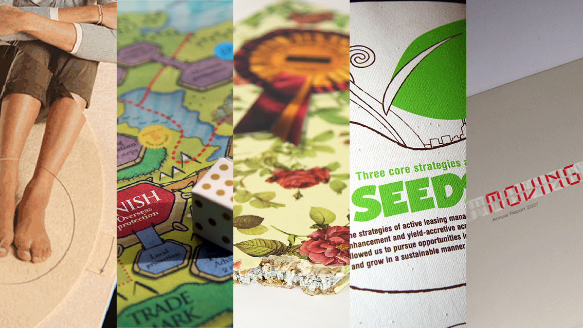
This edition of Quick Reads considers a selection of annual reports published by Edmonton Airports, the company that operates Canada’s Edmonton International Airport, located in Alberta, in the west of the country. The reports featured have won awards including those at the IABC Capital Awards, Advertising Club of Edmonton, or the Marketing Magazine Awards.
The airplane is a powerful image. It may suggest business, leisure, exotic locales, friendship, long or short distances, time and a myriad other things. And underneath it all, it is a symbol of an earthbound species’ daring and inventiveness – powered flight.
Edmonton Airports handles these ideas in a number of ways and here, it uses illustration to convey them. Notably, the illustrations consistently tend toward the minimalist.
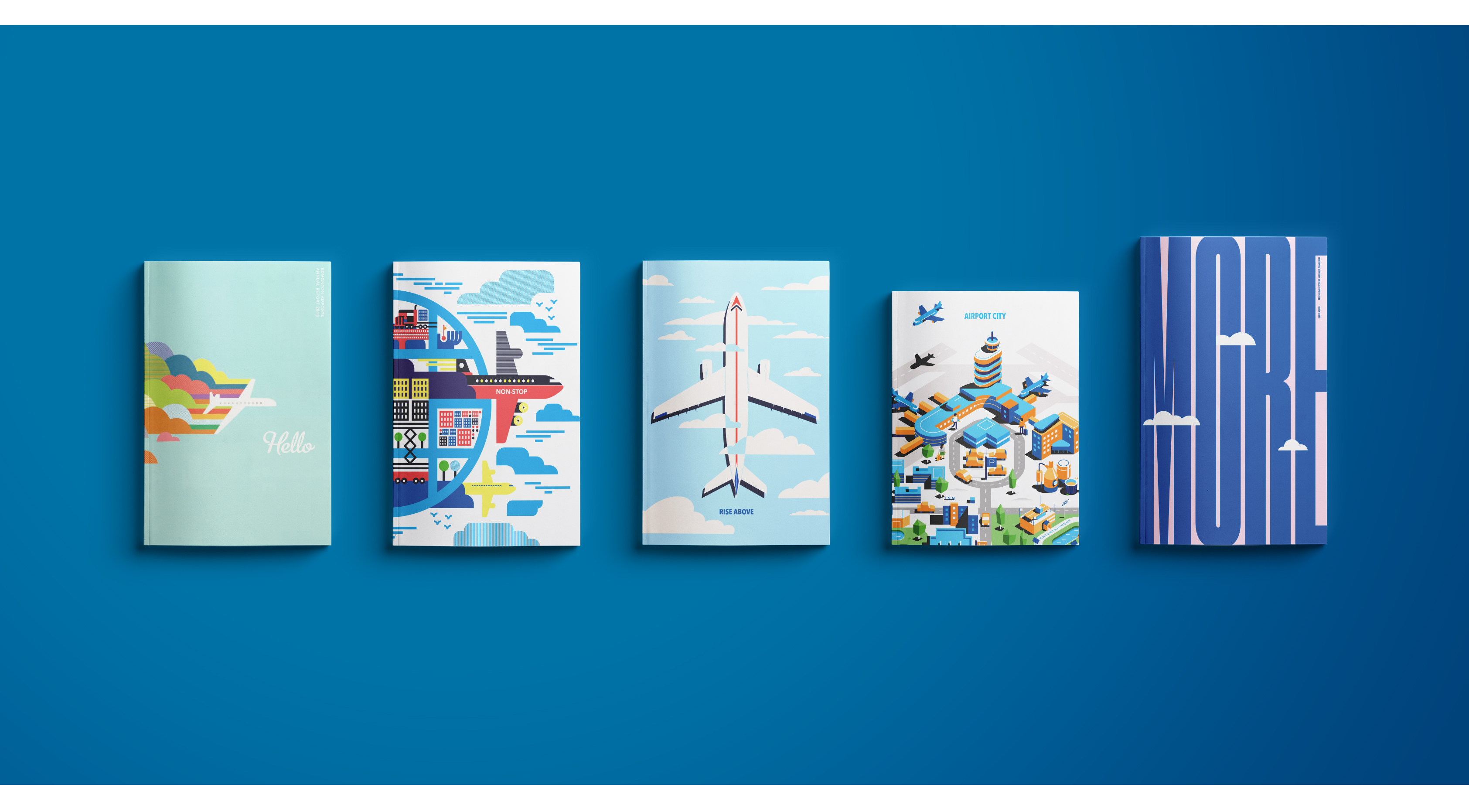
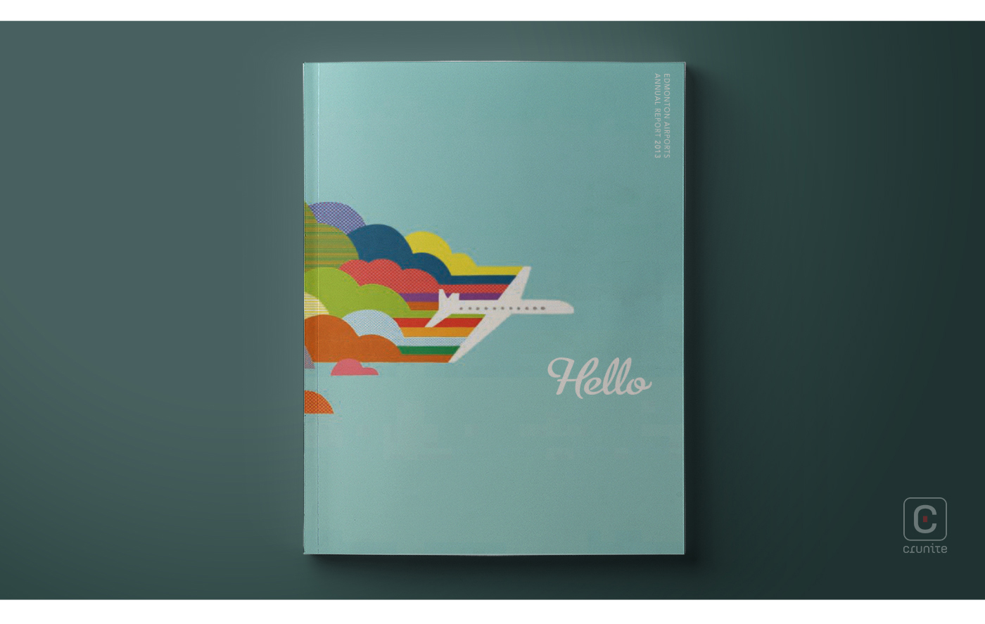
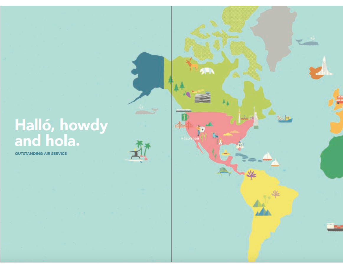
2013’s report uses colour effectively to echo the title of the report – ‘Hello’. The idea of a friendly greeting is boosted by the use of a bright, soft colour palette, simple pattern, and a friendly typeface.
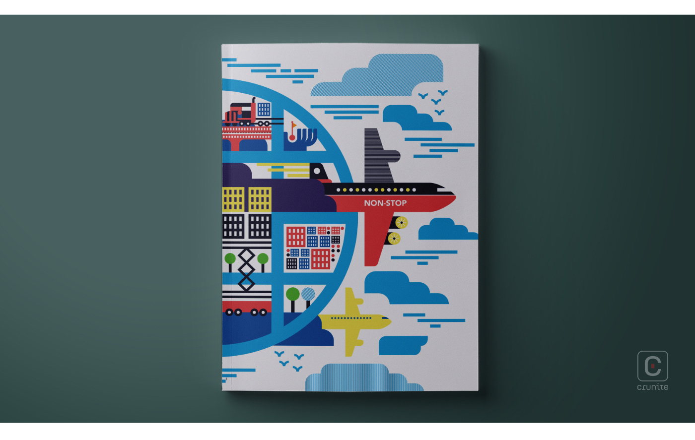
2014 retains the minimalist illustration style, but this time with twice the number of planes, in a composition that conveys energy, speed, and business. The long-haul truck, train, dense city grid, and speed-lines suggest an airport that is thriving.
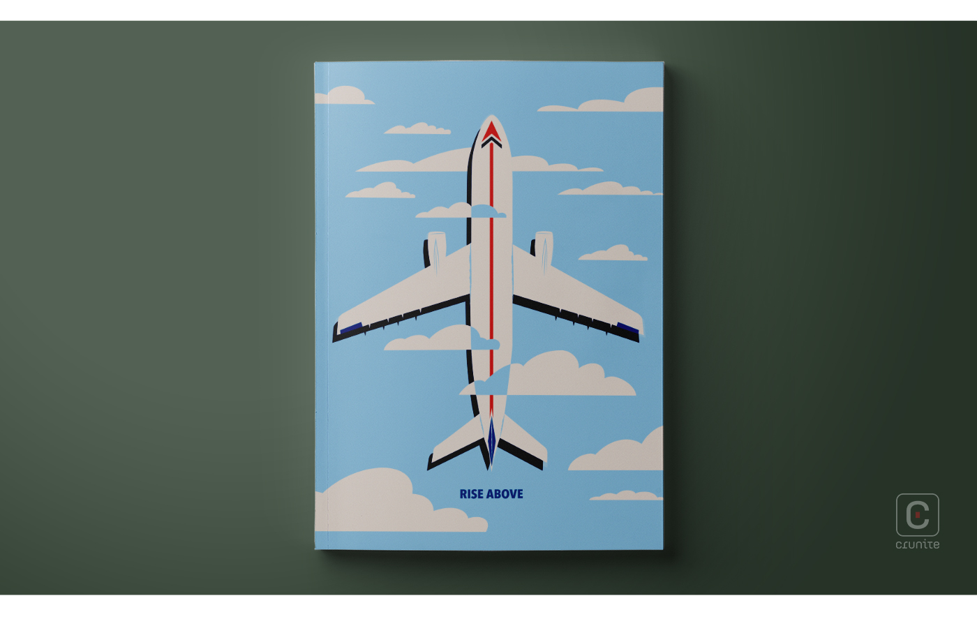
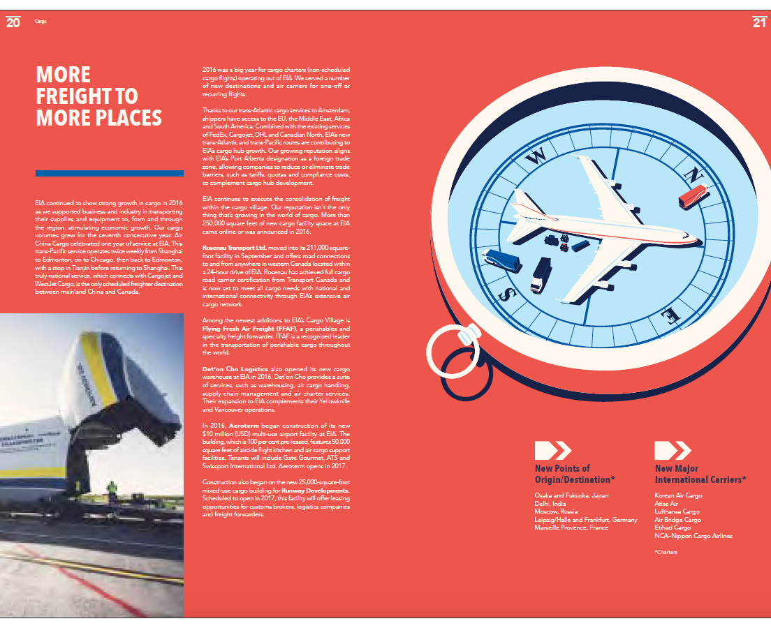
2016 takes a different direction, leaning further into minimalism in order to convey a singular purpose, in rhythm with its title, ‘Rise Above’. Colour and iconography are used effectively to reinforce this message, with a sharp red arrow running the length of the plane, vertically, hinting at progress.
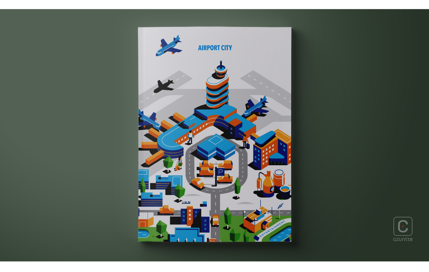
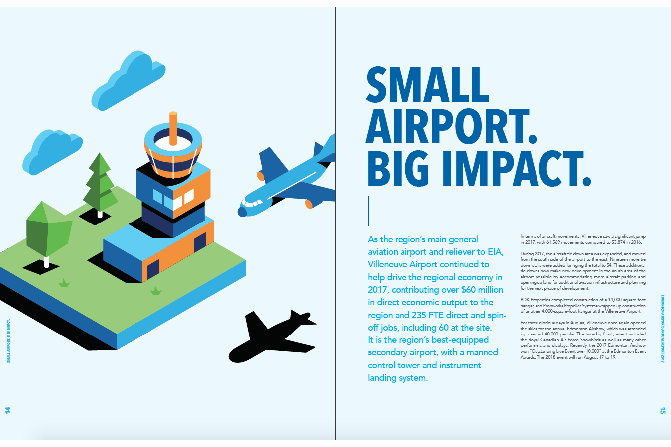
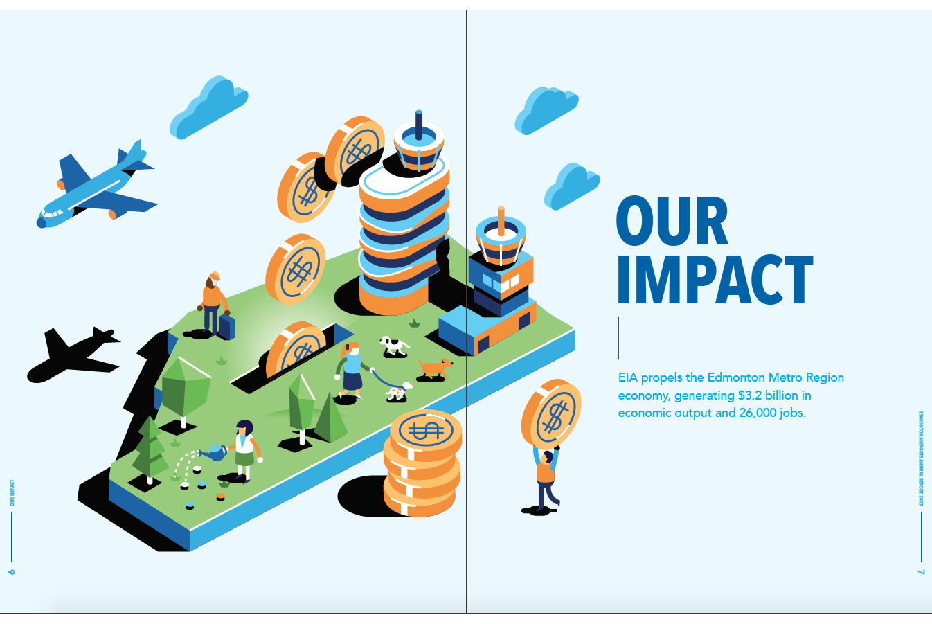
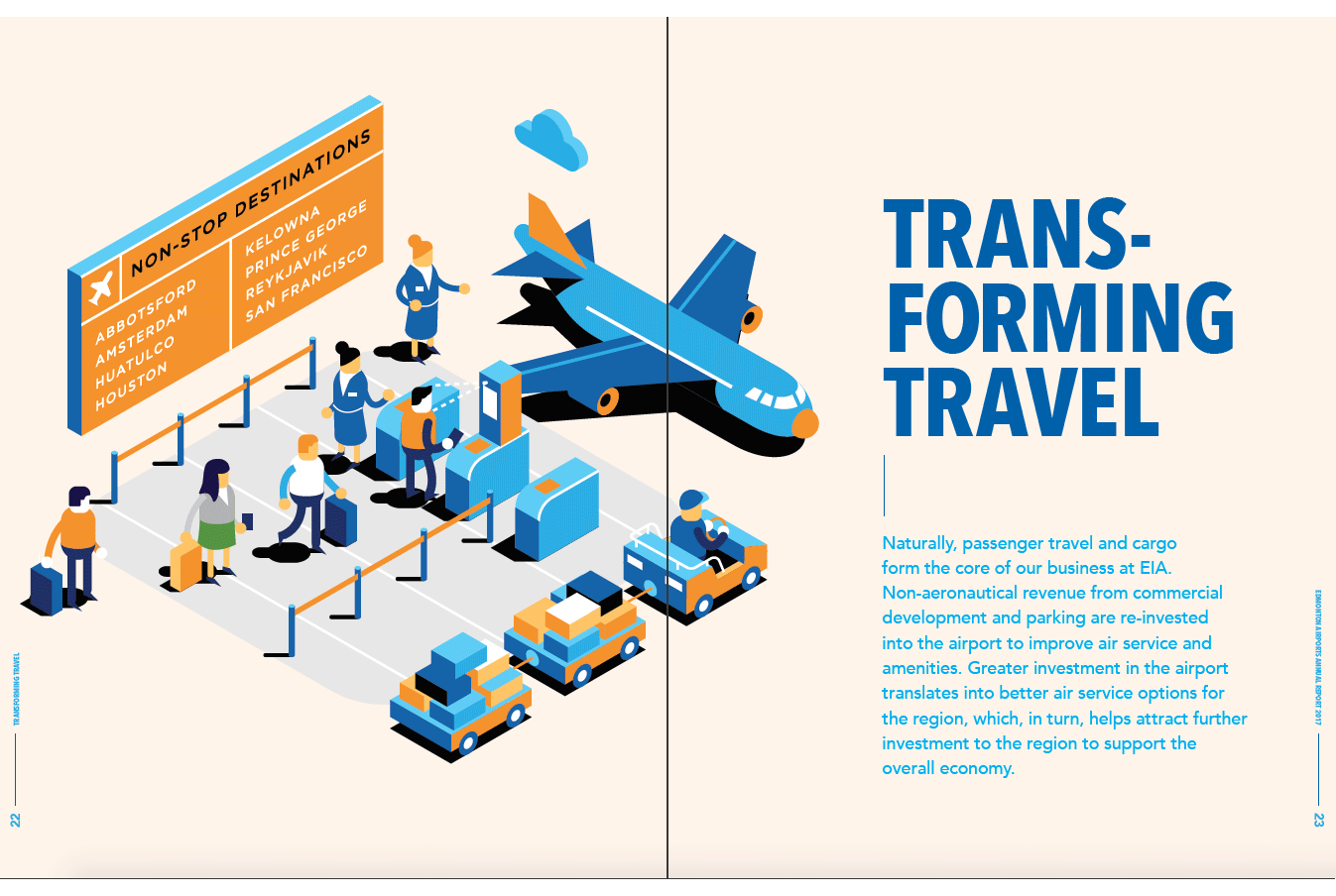
2017 leans in the opposite direction. Using an isometric layout, the image shows a bustling airport, reminiscent of the energy of the 2014 cover. Here the palette is pared down to four colours. It is also the first of these covers to include passengers.
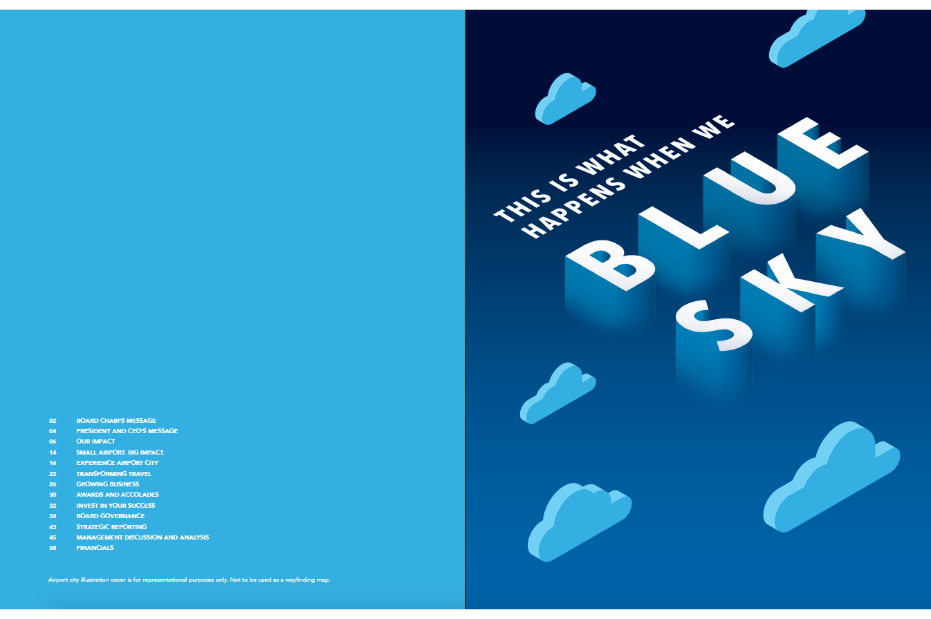
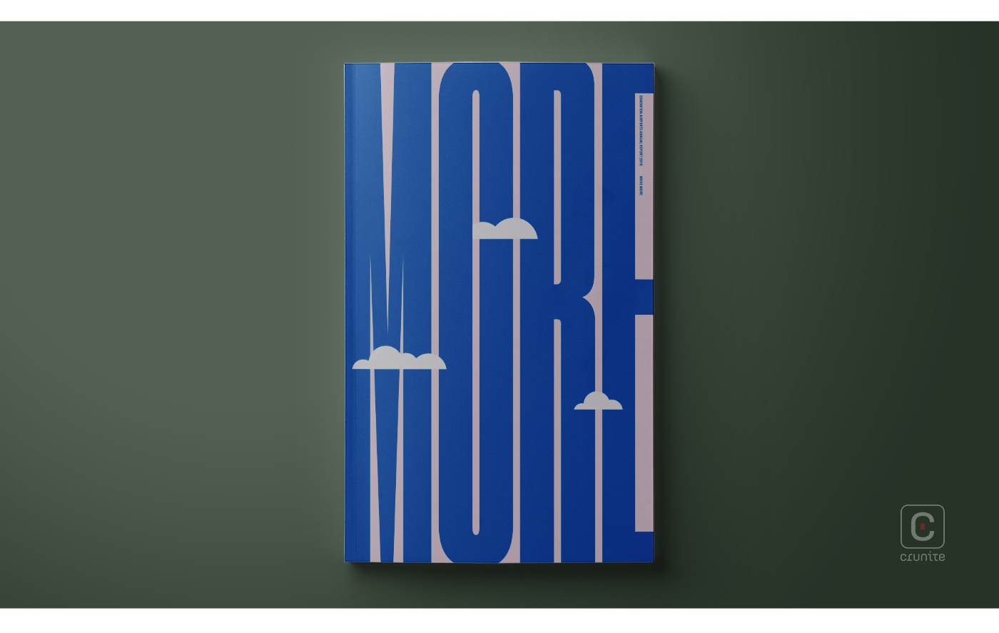
A plane without a plane: 2018 is the only cover in this selection not to include a plane, and it is all the more striking for it. The type treatment is cleverly done, elongating the title (More), making the letters reminiscent of the shape of an airplane. This is further reinforced by the use of blue for the letters and the inclusion of clouds reminiscent of both the 2013 and 2016 reports.
![]()
![]()